Ollee
- Brand Guidelines
- Prototyping
- Visual Design
- Wireframing
- Illustrator
- InDesign
- InVision
- Sketch
OVERVIEW
Backed by BBC’s Children in Need ‘A Million & Me’ initiative, social enterprise Parent Zone created a ‘digital friend’ Ollee, which aims to help children aged 8-13 express their feelings. In my role as Digital Designer I created the core branding for the app, from which a design agency could build out the final product. Final assets including logo, colour scheme and typography were documented in brand guidelines.
PROBLEM
- High cases of anxiety, depression and trauma amongst children had created a crisis in children’s mental health and wellbeing.
- Children struggle to understand and communicate their emotions on difficult topics.
GOALS
- Build an approachable visual identity for Ollee that encourages children to recognise their unsettling emotions and communicate them to adults around them.
- Create a logo, colour scheme and select typography for Ollee.
- Create brand guidelines for the Ollee brand.
wireframes & early prototype
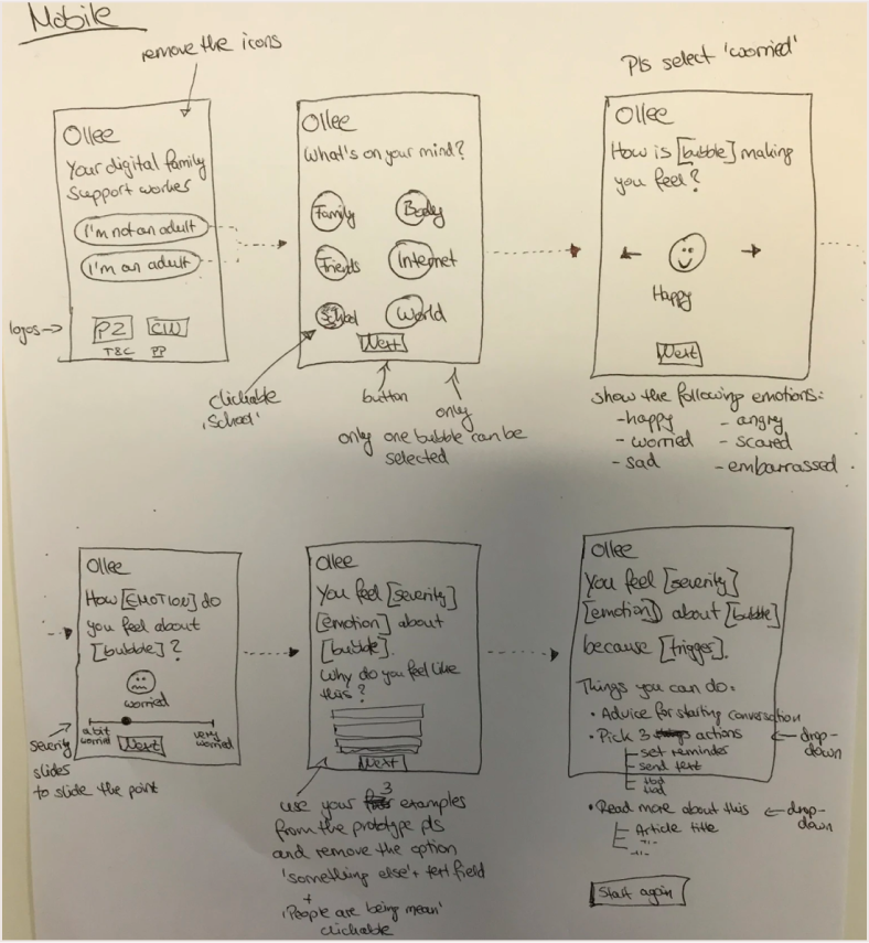
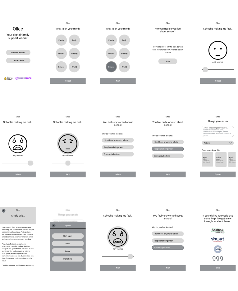
Our first priority was to create an early concept for Ollee that could communicate the purpose of the app before it existed, and allow design agencies to assemble their pitch back to Parent Zone. I created an early prototype of Ollee with low fidelity wireframes which was presented during these early meetings. We decided on some basic flows to demonstrate a child reporting they were ‘quite worried’, and then ‘very worried’ to show the varying levels of responses we imagined Ollee giving for those different scenarios.
logo development

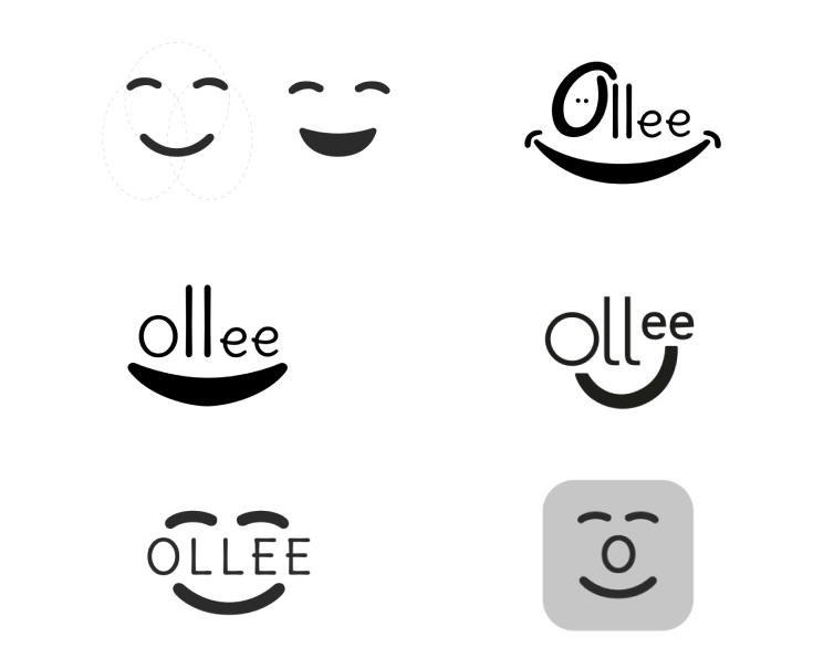 As Ollee was something to confide in, we needed an approachable and positive feeling logo. We also decided very early on that the full name ‘Ollee’ should be present in the logo for visibility.
Final logo

Colour development

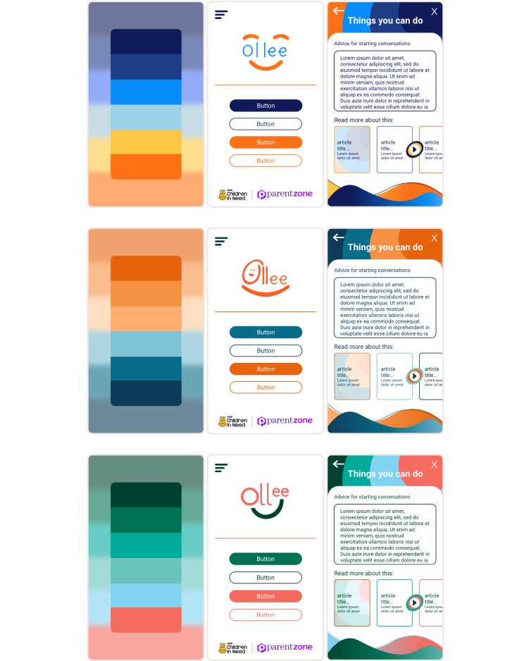 Some colour developments placed within mock mobile screens and alongside logo ideas to give a sense of how they could work.
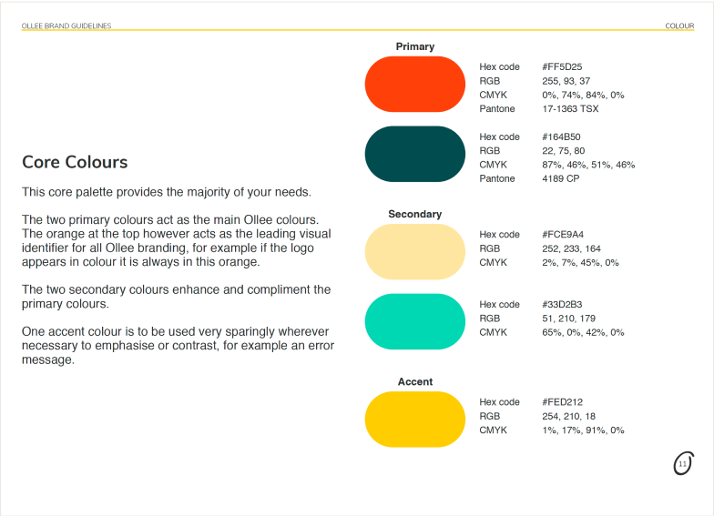
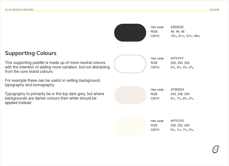
Final colour scheme
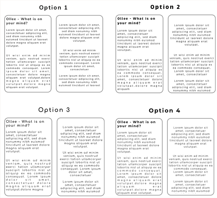
Testing typography

Final typography
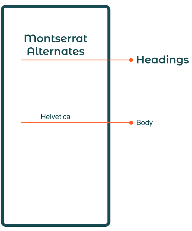
The intention behind our typography choices was to be very straight forward for main body text, with a slightly animated feel in headings to maintain that approachable feel.
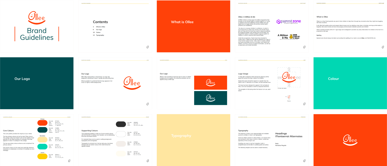
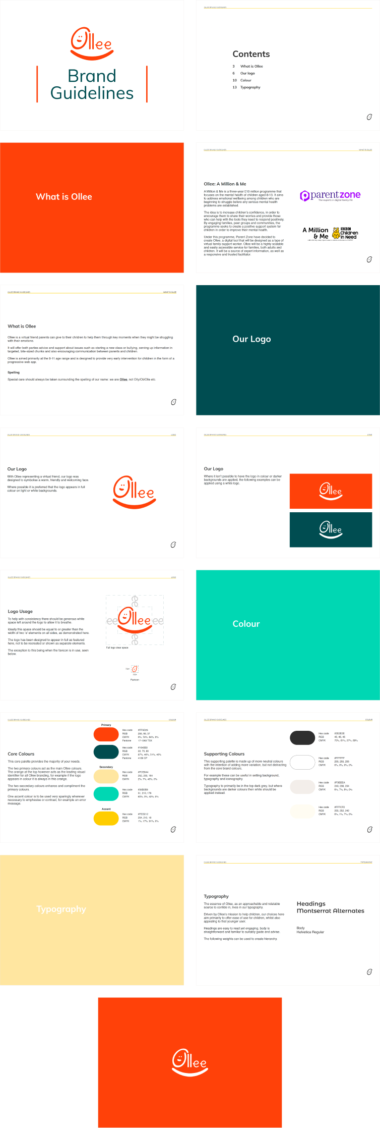
Brand guidelines
Reflection
This was an extremely satisfying project to work on due to the underlying objective of supporting children’s mental health. I was proud of the work I produced being the only designer at the company, successfully navigating input from various different stakeholders to produce the Ollee brand. I was disappointed to not be involved in the next stage of this project, in designing Ollee the product. This confirmed to me however my drive and preference to work in Product Design, which is what I pursued after this role.