Edit Table
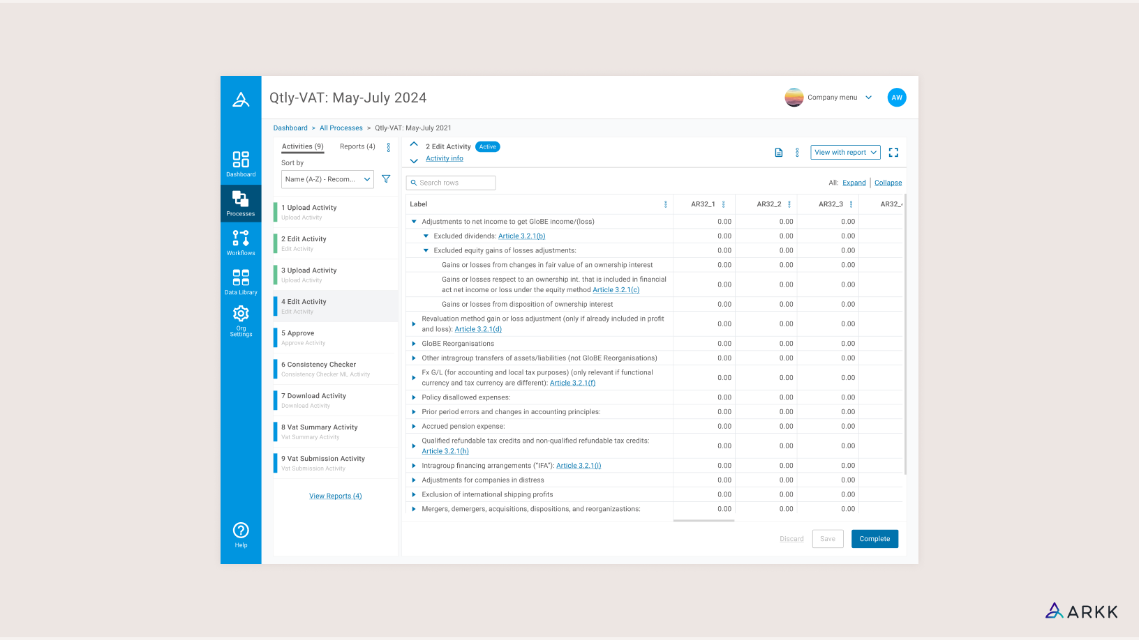
OVERVIEW
Through the emergence of the Pillar 2 framework, multinational enterprises are expected to adhere to a global minimum tax on profits. Customers subject to these new rules would be required to submit large amounts of data, and we wanted to offer them a convenient way of doing this in an interactive table. It was also strongly felt that the benefits of an editable table would stretch beyond this use case. I was the only designer on this project, working mainly with the CTO and a small development team to fit new requirements into our existing table design, and create a new audit log for users to track any changes in.
PROBLEM
- Users are limited in their ability to edit data within tables.
- Incorrect or missing data could only be addressed by updating original files then re-uploading.
- A change report which listed any changes made on the platform was difficult to read and interact with.
GOALS
- Streamline the process by which users are amending table data to help with Pillar 2 submissions and other activities.
- For this process to occur on the platform.
- Users are able to keep track of these changes in an easy to use audit log.
KICKOFF
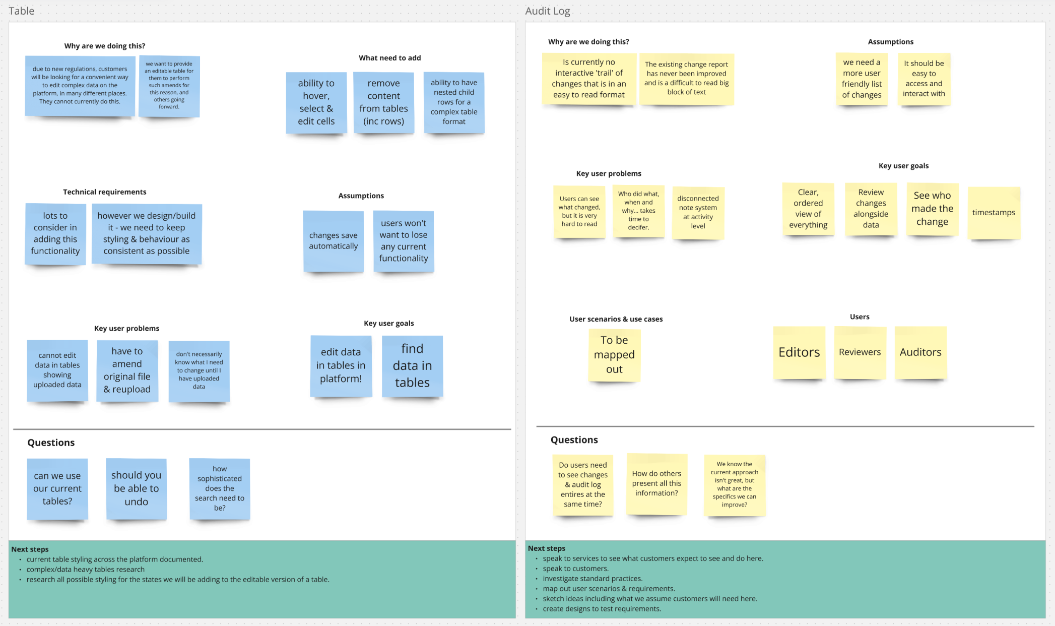 We conducted an initial kick-off meeting to understand the problems we faced for both sides of this project. As Pillar 2 was a new set of rules, there was no existing process for us to examine how such data gets submitted. We instead focused on understanding how users might access and amend data in complex tables, and what they expected to see with regards to an audit trail.
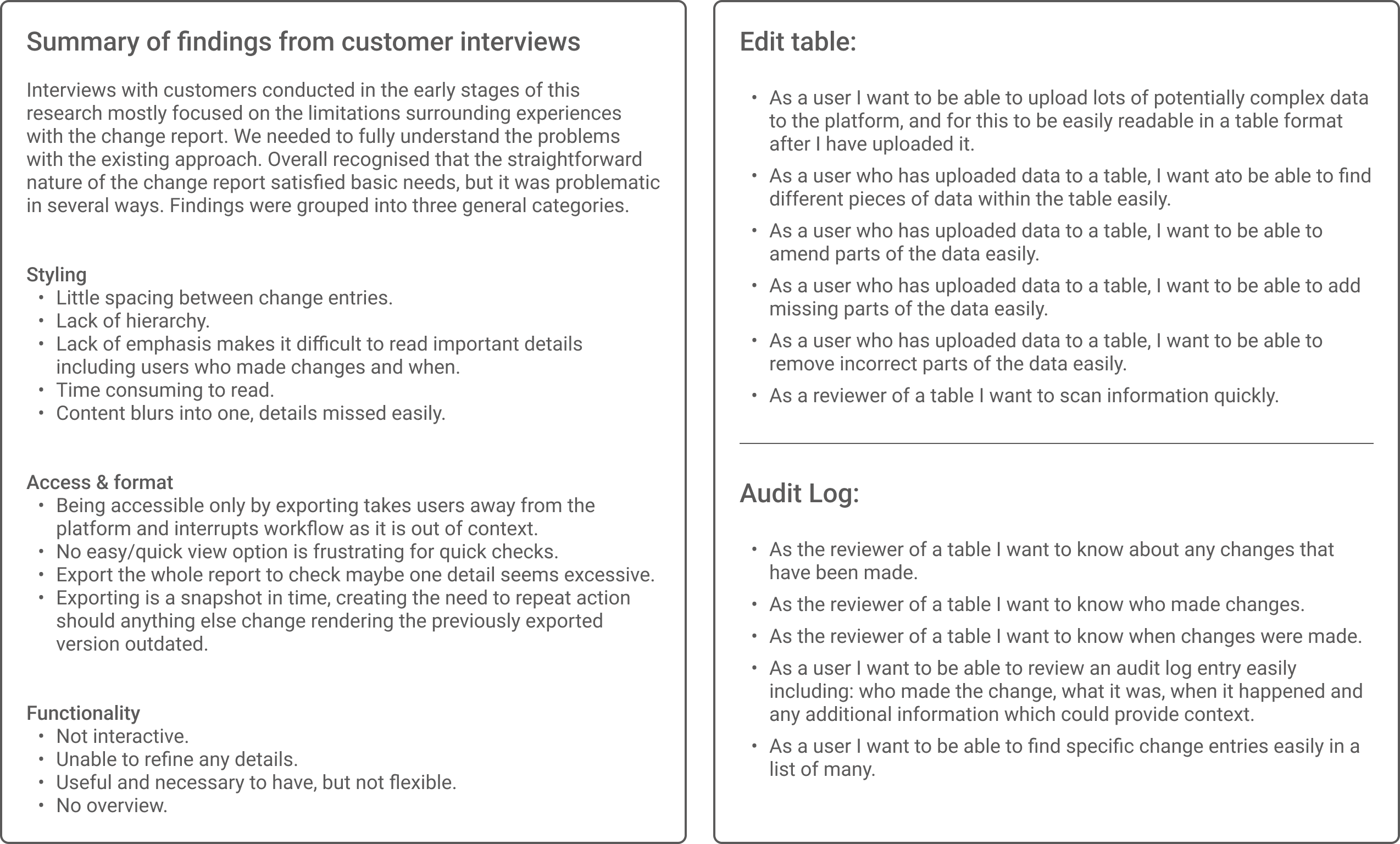 I listed out some user scenarios following interviews with customers to help shape the solutions we came up with.
AUDIT LOG RESEARCH
The existing approach to documenting changes on the platform was through a ‘change report’, which could only be viewed on export and consisted of a list that was difficult to read due to a lack of any helpful styling. This project brought welcomed motivation to update this feature.
 I conducted research to explore the structure an audit log could take, and the standard features users would expect to see here. The majority of these examples presented audit logs on separate pages, whereas we wanted to consider an audit panel that users could view alongside their data. I then conducted additional research into panels that were not necessarily for audit purposes, but could help inspire different approaches for us to take.
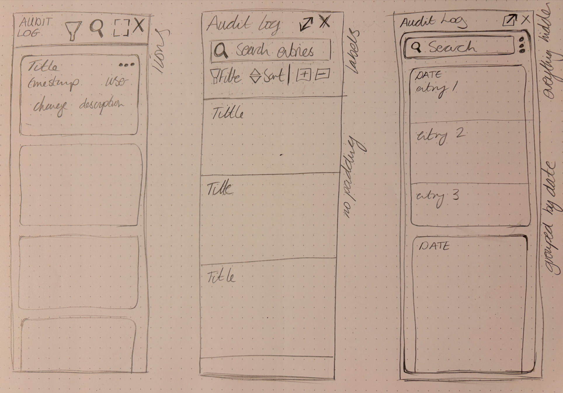 After collecting all this information and with the requirements in mind I sketched out initial concepts for an audit log panel. Initially a big focus for us was to have a very narrow audit log panel to save on space, which you could expand out to fill the activity frame in this view.
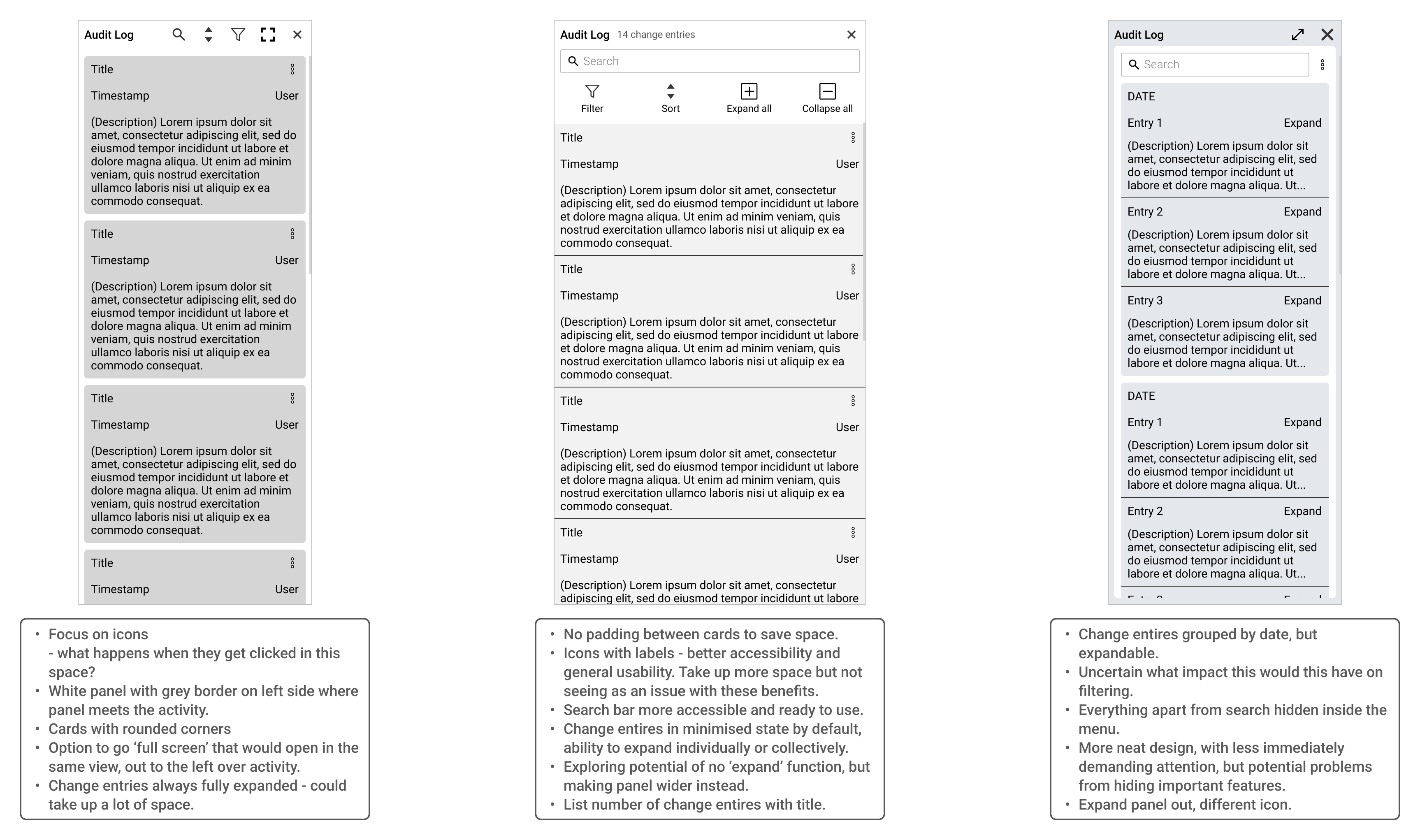 I then developed some wireframes to consider different solutions. The differences I considered related to icons, panel width and expansion behaviour.
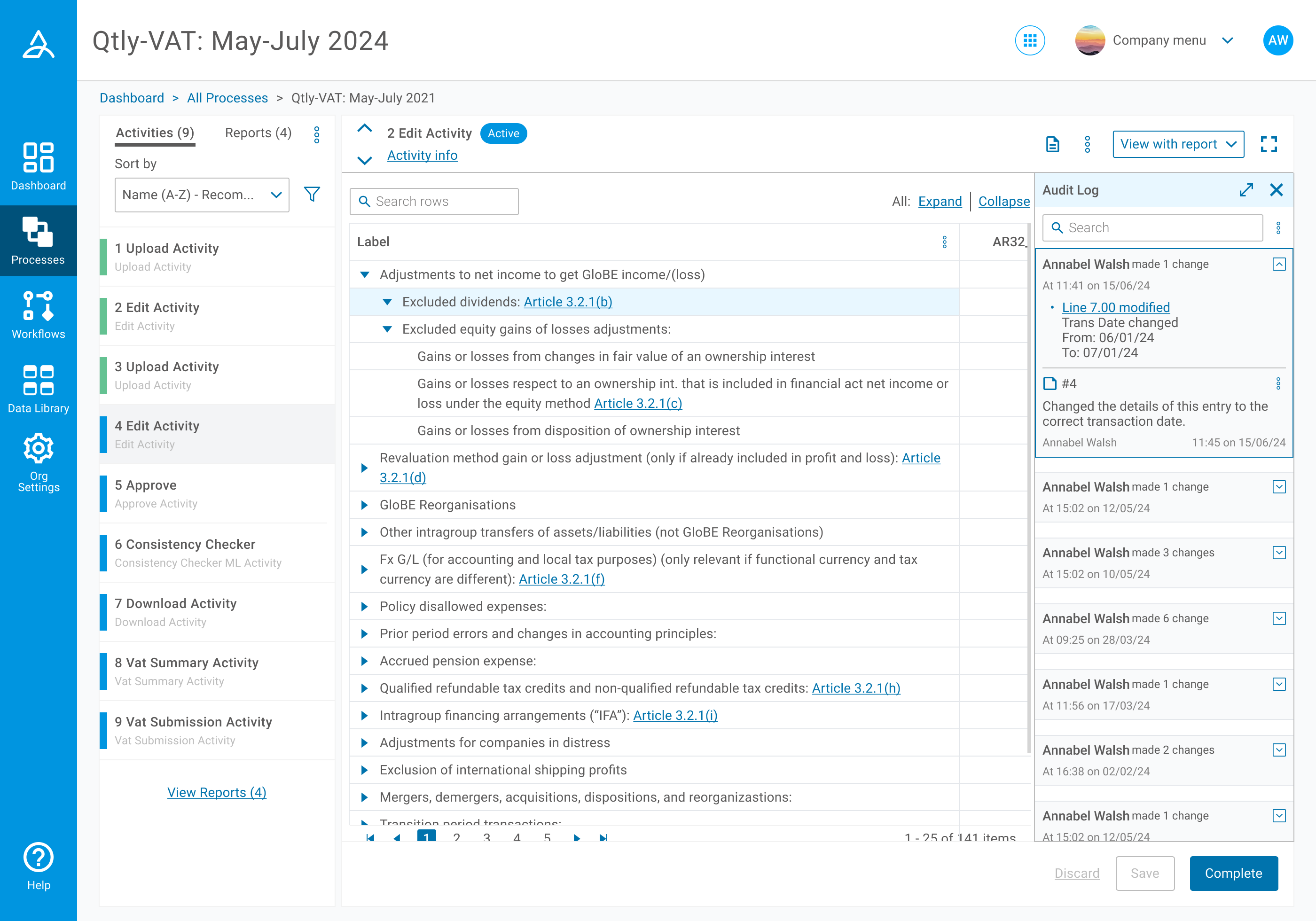 In this version of the panel I developed to be tested, one of our main priorities was to make good use of space. For this reason we placed the sort and filter inside a menu next to the search bar, which we saw as more important. We also included the ability to expand the panel to the left over the activity. The stretched to the edge design of the cards was also intended to save space. We found however, that hiding features meant users didn’t know such things were there to help them navigate the panel. Expanding the panel over the activity also proved counterproductive in that it covered the data they were reviewing.
FINAL DESIGNS
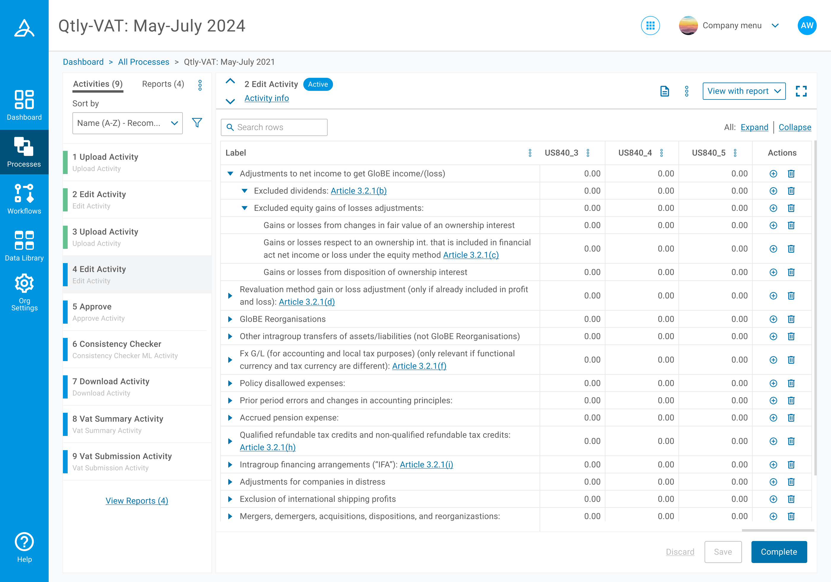
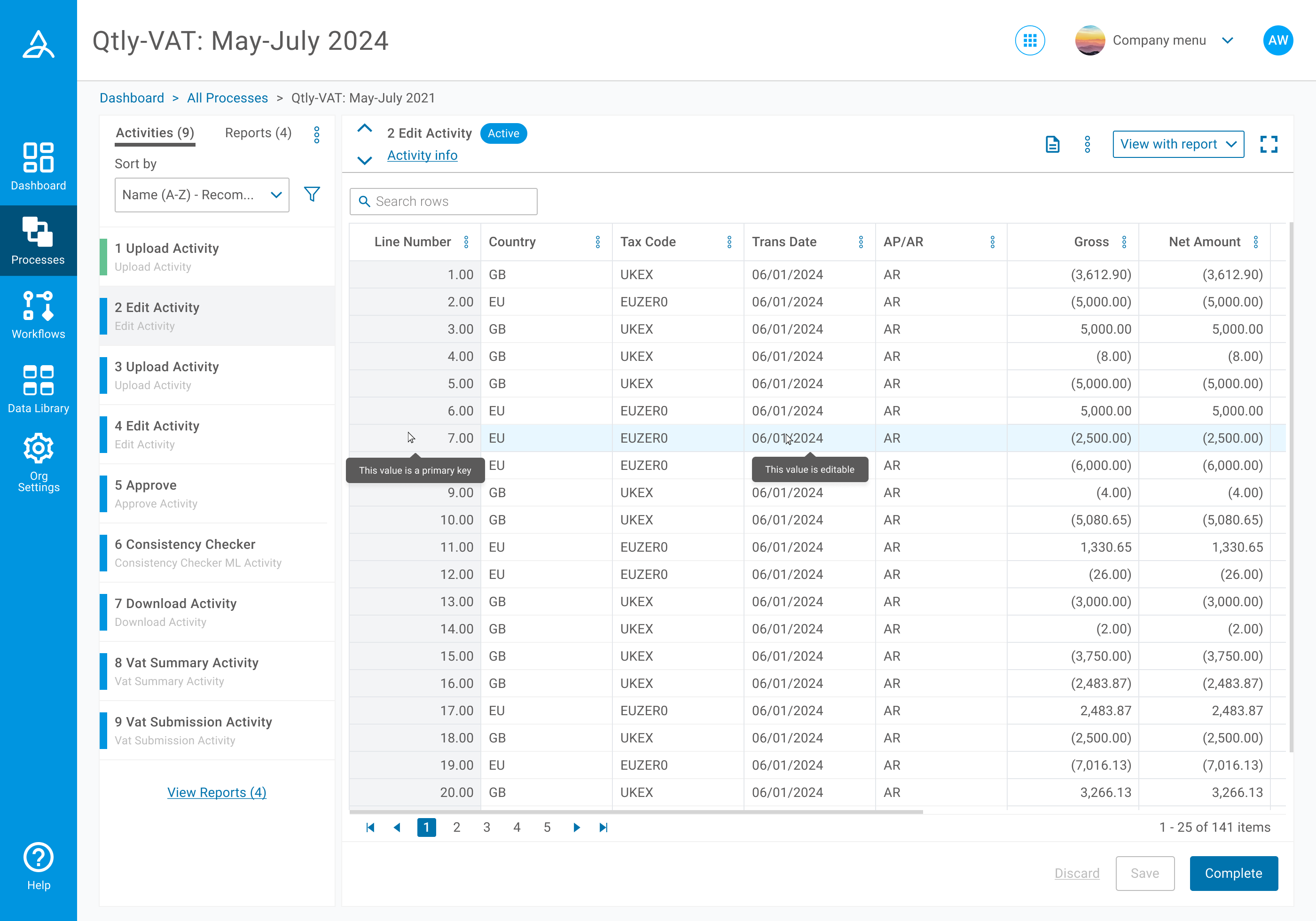 As we already had a design for tables across the platform, the task here was more about introducing the new states we needed in an appropriate style. I experimented with different options here, but we preserved our existing pale blue row hover and introduced the selected state for a cell to be edited as a white fill with a thicker blue border. This was consistent with behaviour elsewhere for input fields. Further modifications we applied included horizontal and vertical lines across the table values, something we had previously achieved with space, but could not afford to do in this data heavy scenario.
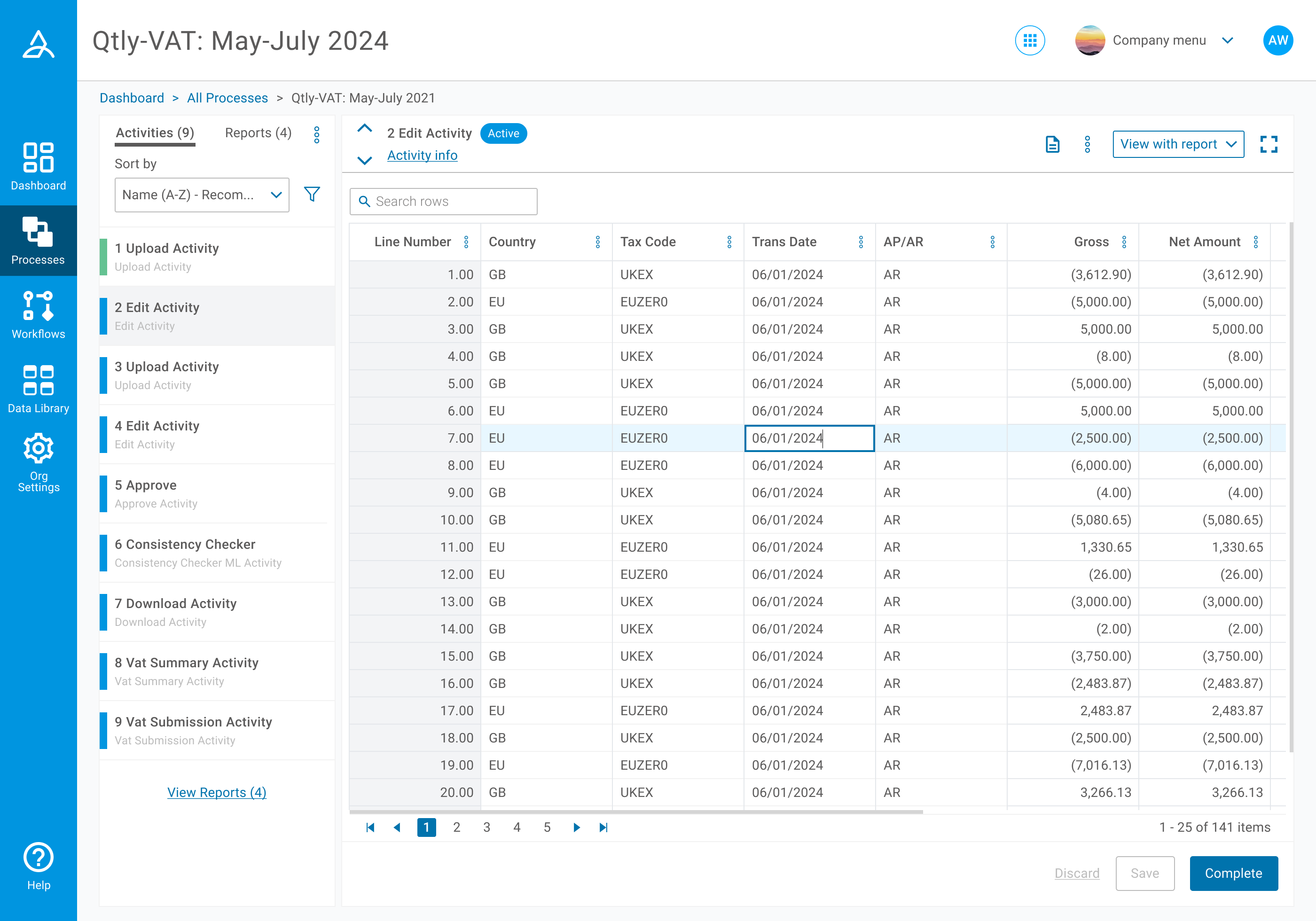
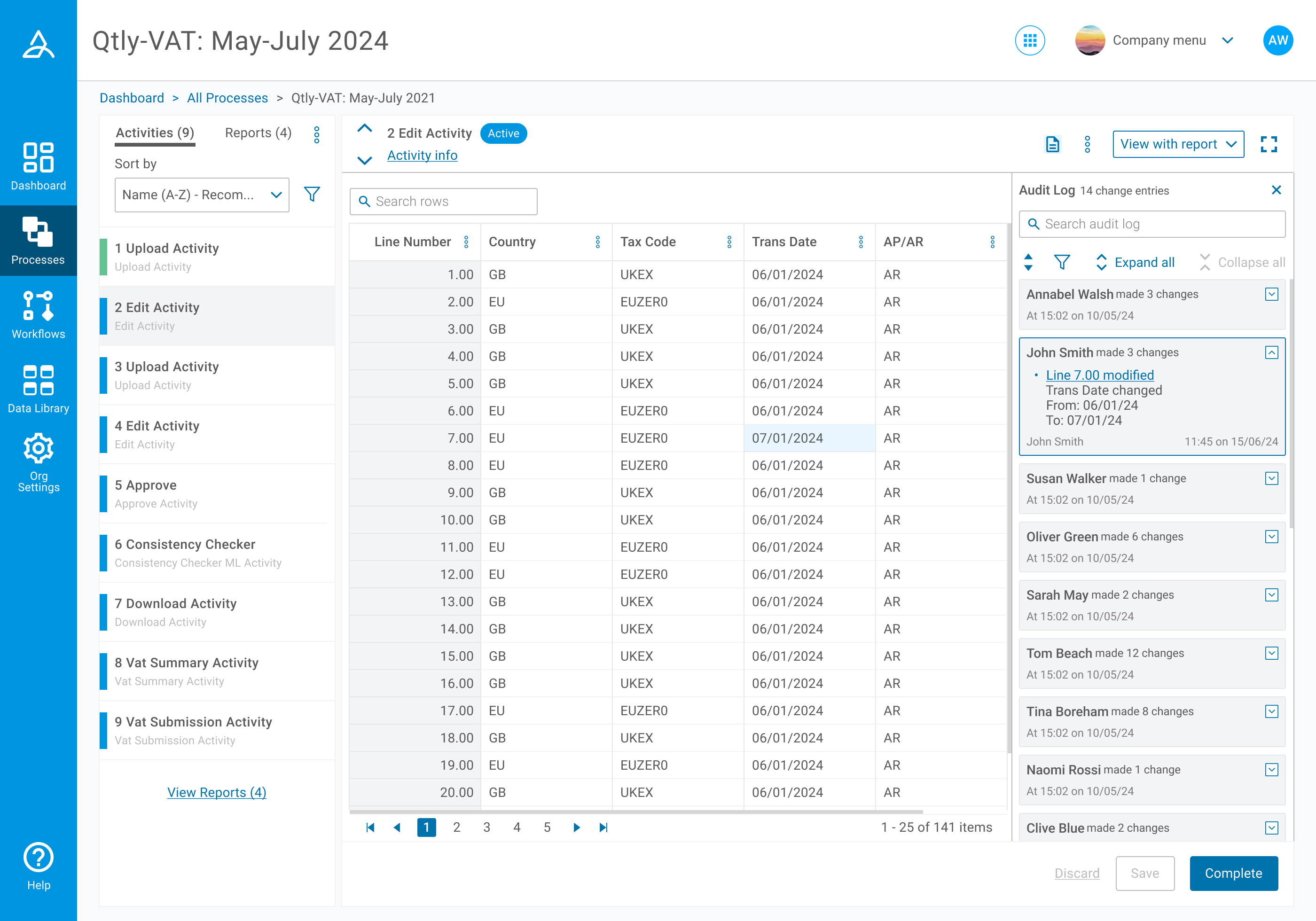
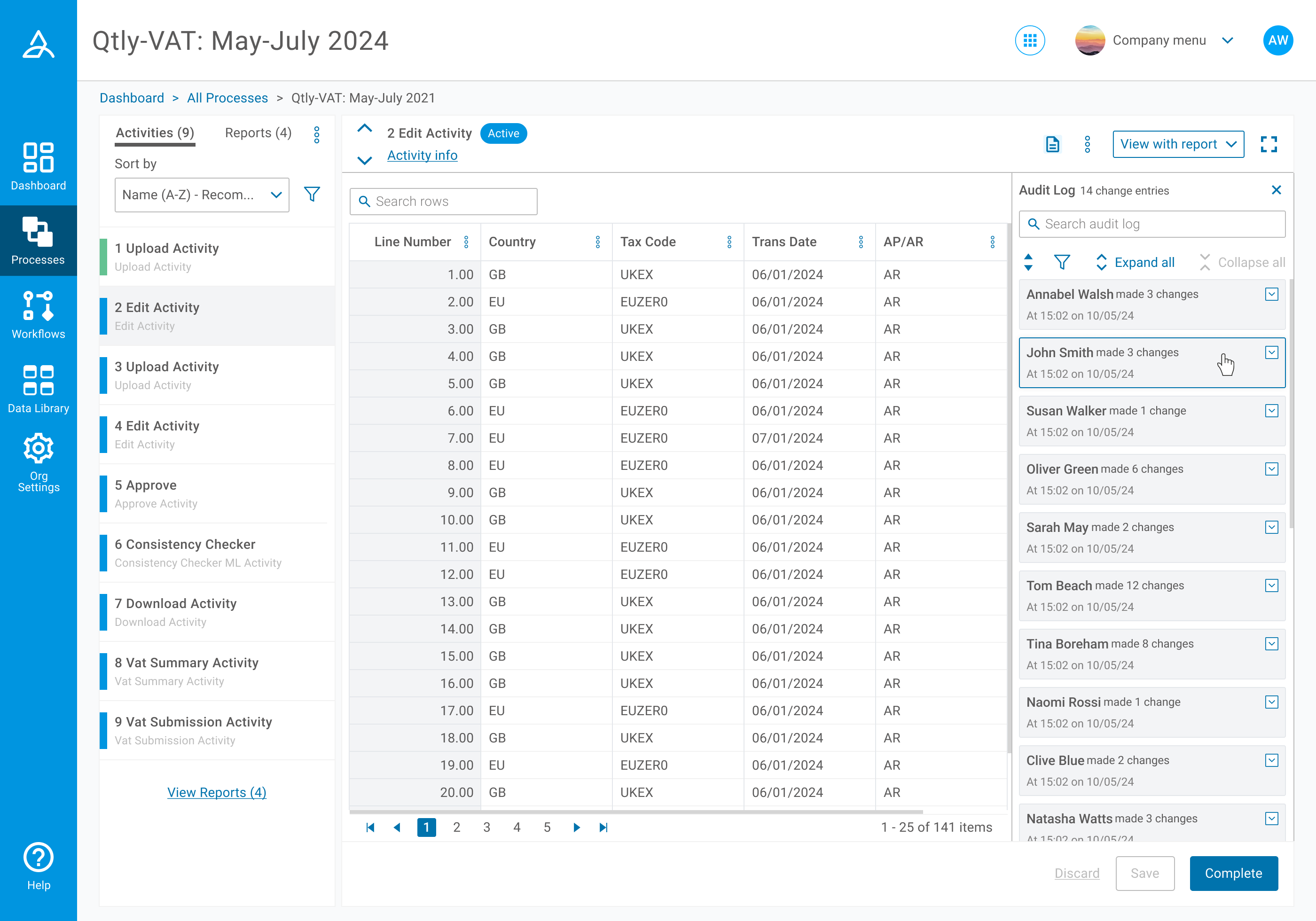 I made developments to the audit log panel based on feedback we received, bringing features back into view, including icons with labels for better usability. We were satisfied that we could save adequate space by having the minimised state for the cards as default, and that the rounded grey cards provided a cleaner visual. But with this, it then became apparent that the ability to expand or collapse all cards would be helpful. We found a full screen view of the panel was not overly helpful to users, but they could resize it here to see more details in their view.
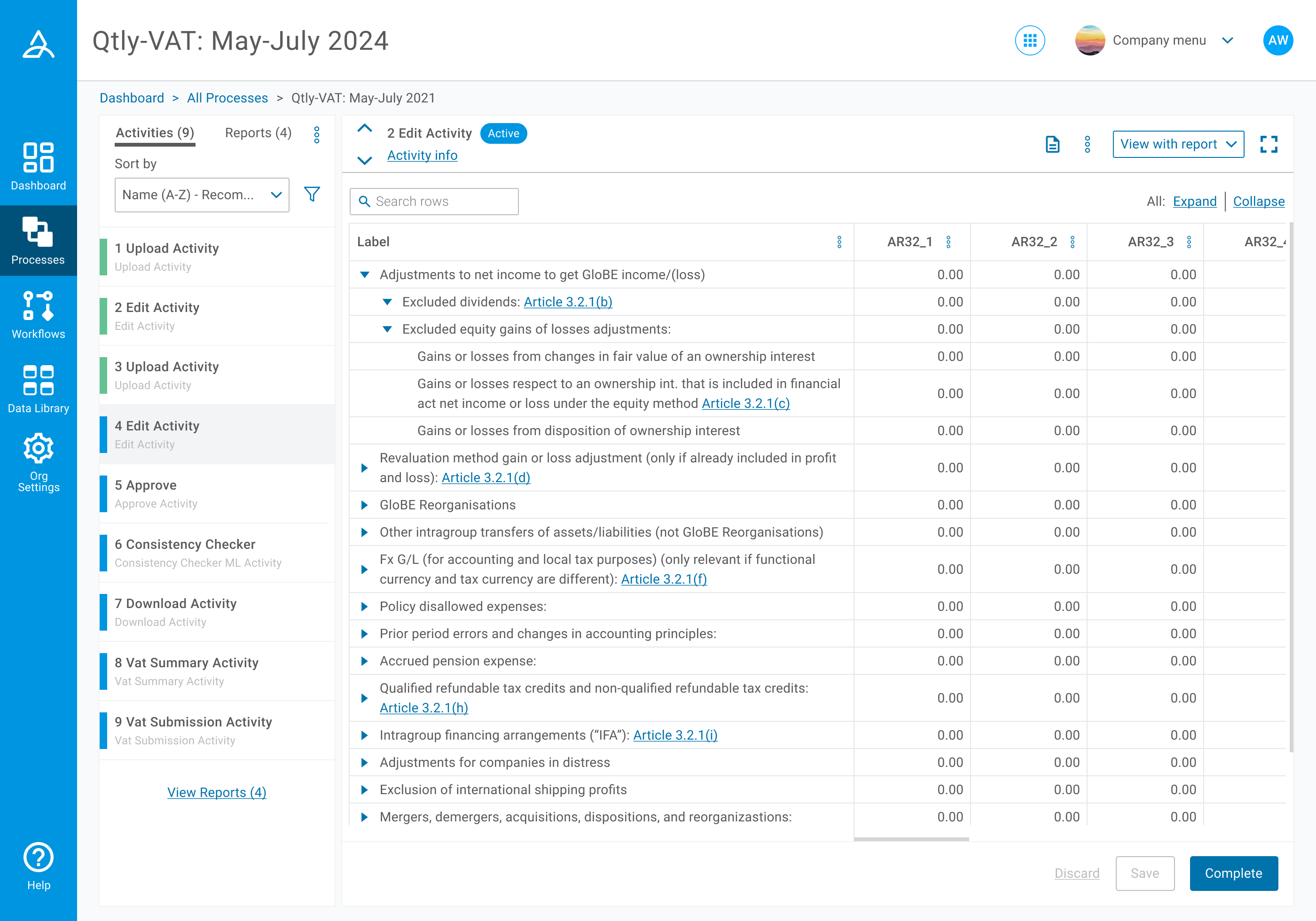
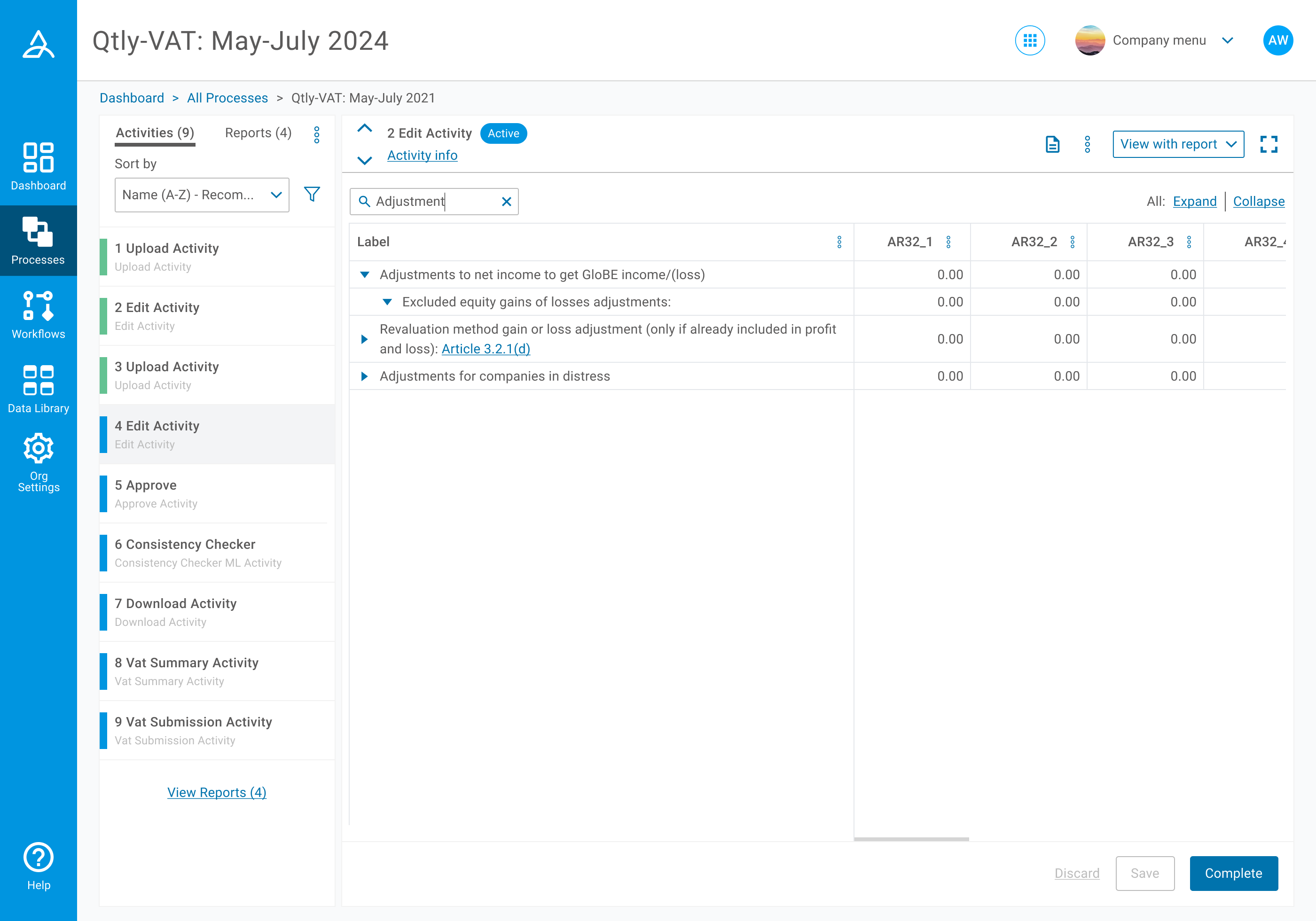
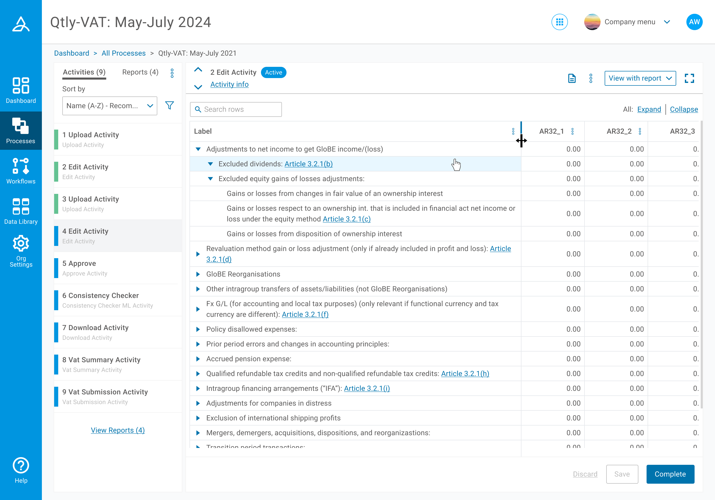 As part of this project we also designed a nested edit table that could accommodate multiple levels inside a single column. This was related to how data that needs to be submitted as part of Pillar 2 is grouped.
REFLECTION
This was a unique project in that we worked in a very small team, but that meant we could make progress fast with constant check-ins and updates. I valued owning the design part of the project, but also having that direct line of communication with the development team to work through our solutions. If we had more time, we all wanted to focus on developing the table highlights which show when a specific change entry is selected on the audit log. This carries certain complexity with the different effects that would be needed, for example to show the difference between a row which has been removed, and effectively not even on the table anymore, compared to a cell which has been amended.