Navigation redesign
OVERVIEW
Within the ARKK automation platform, users build out financial processes which hold different types of activities they need to complete those processes. This is a key area of the software, which was in need of a redesign. Alongside the Head of Design and one other Product Designer, I was responsible for the UI Design work here. In addition I supported my two other colleagues in the discovery and planning stages at various points in the process.
PROBLEM
- Users lacked any sort of navigation within a process.
- Multiple activities could be expanded simultaneously, removing context.
- Users engaged in significant amounts of scrolling to access basic information.
- It was a challenge to sift through or refine lots of complex information that was on show.
GOALS
- Improve the layout of one of the most important pages on the platform, including a refreshed design to reflect updates done elsewhere.
- Help users access what they need more quickly through ordered navigation.
- Give users access to high level information about activities, without needing to open them.
- Improve the filtering and sorting of activities.
KICKOFF
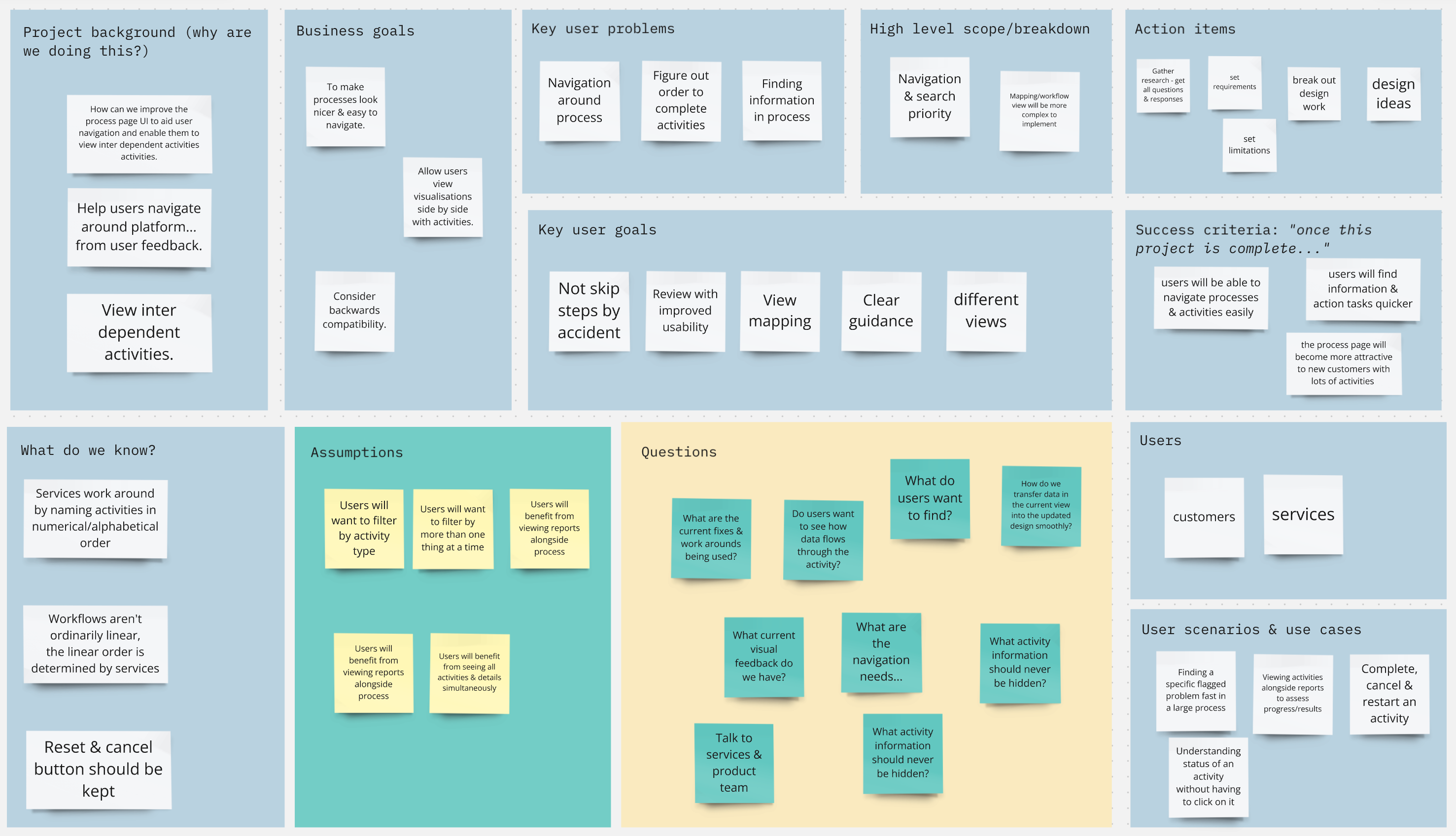
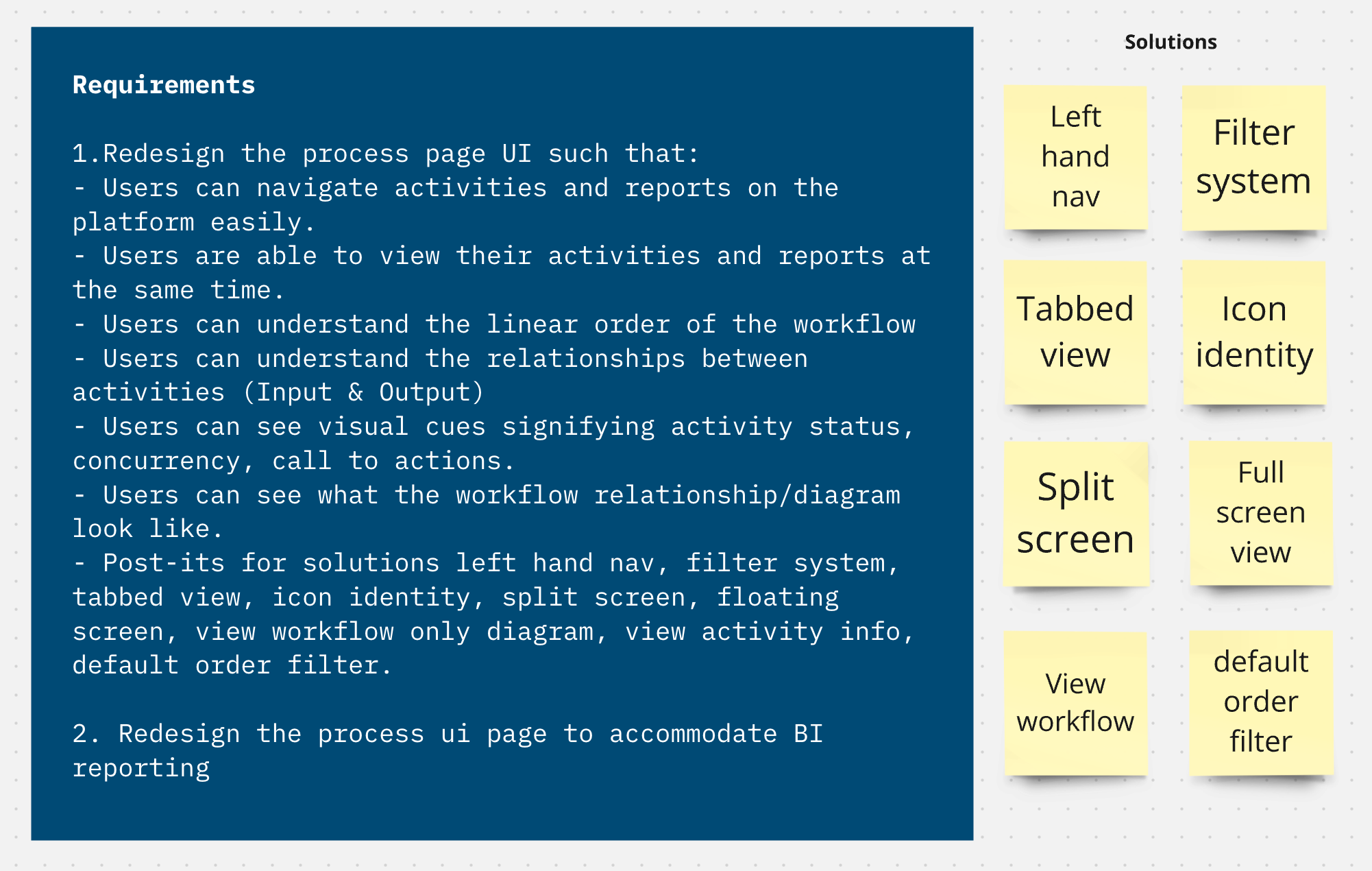
As this was a large project with many different problems, we held several kickoff meetings to categorise the tasks we had. Above is a board from the early stages of the process for the main redesign, along with some requirements we drew from the session. In terms of the redesign, introducing navigation was a paramount concern.
OLD VIEW
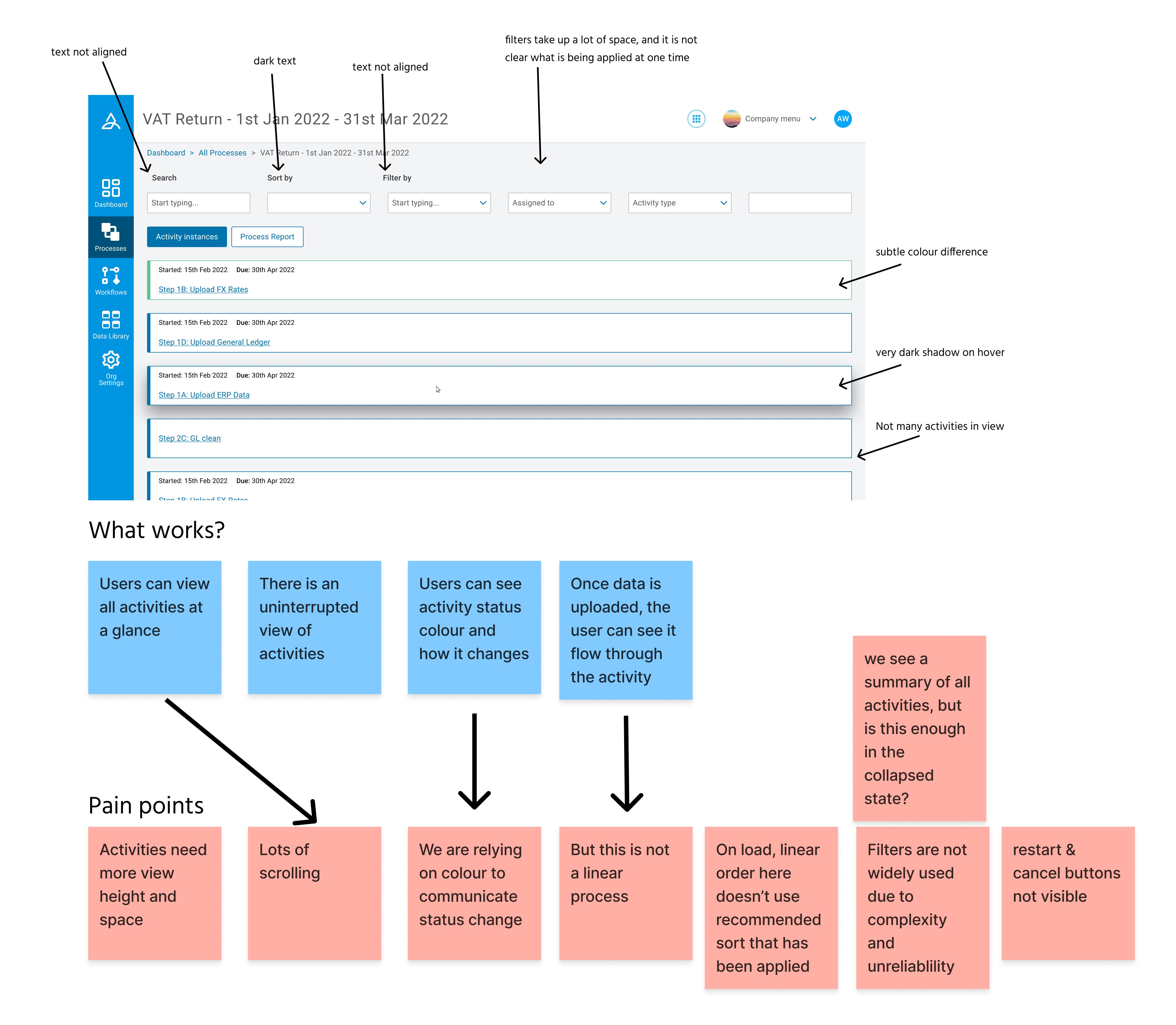
One of the initial tasks I carried out was a detailed assessment of our current process view, examining positive and negative aspects of usability and visual design. We already had an idea of what wasn’t working from customer feedback, but wanted to pair this with our own analysis of the current situation as we saw it early on. One of the main conclusions we drew was that we felt we were looking at a huge list, but that it was hard to figure out the details of the items on that list in this current view.
INTERVIEWS
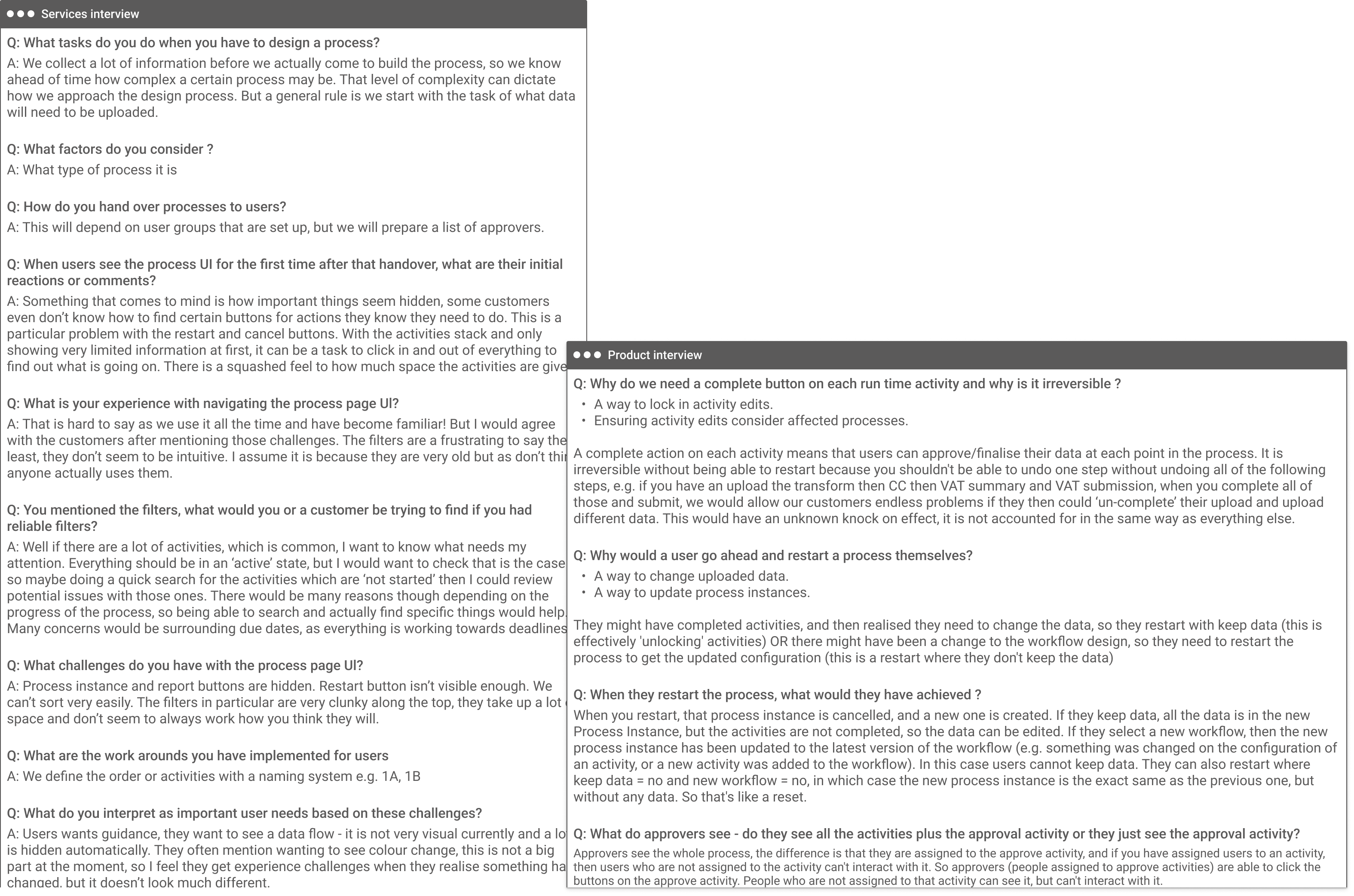
We interviewed members of our internal services team, who set customers up on the platform and then maintain an ongoing relationship with them. In this sense they represent a valuable type of user to us, who use the platform daily, but also gather insight on how customers experience the platform. I was responsible for speaking to a few of these individuals, above are snapshots from an interview with a member of the services team, and another with the Product team.
FILTER RESEARCH
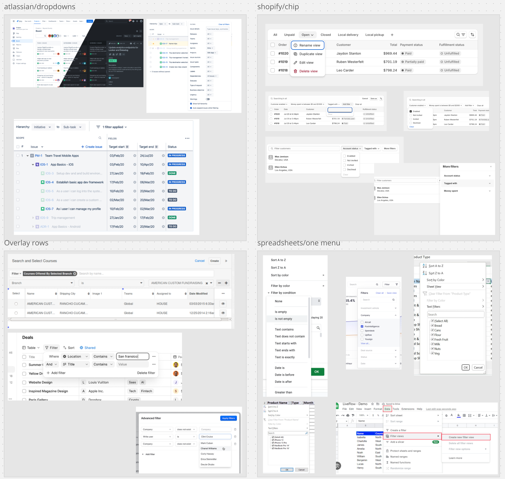
From the conversations we had with various internal teams and customers, we discovered that the existing filters were causing more issues than we originally assumed, which allowed us to dedicate more time to improving them. In dividing up responsibilities of the whole project, I took on this investigation regarding filters. Part of this was to research how existing filters could work on complex products through market and competitor analysis.
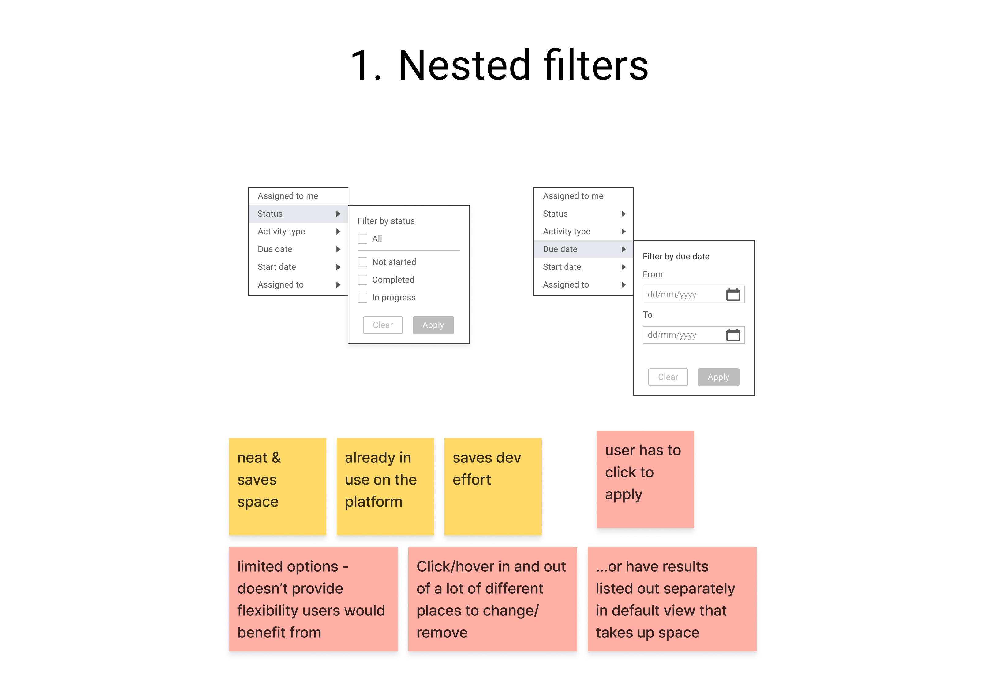
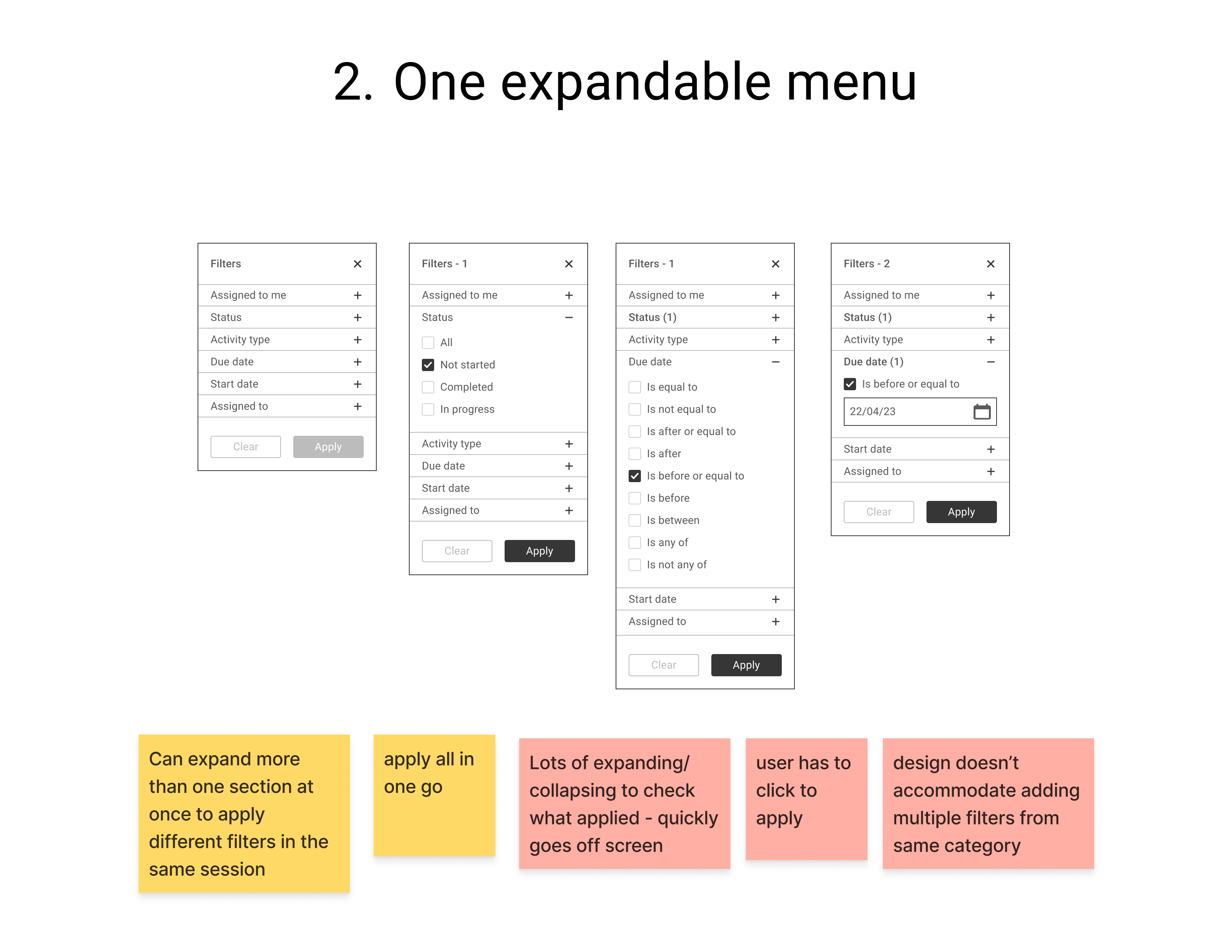
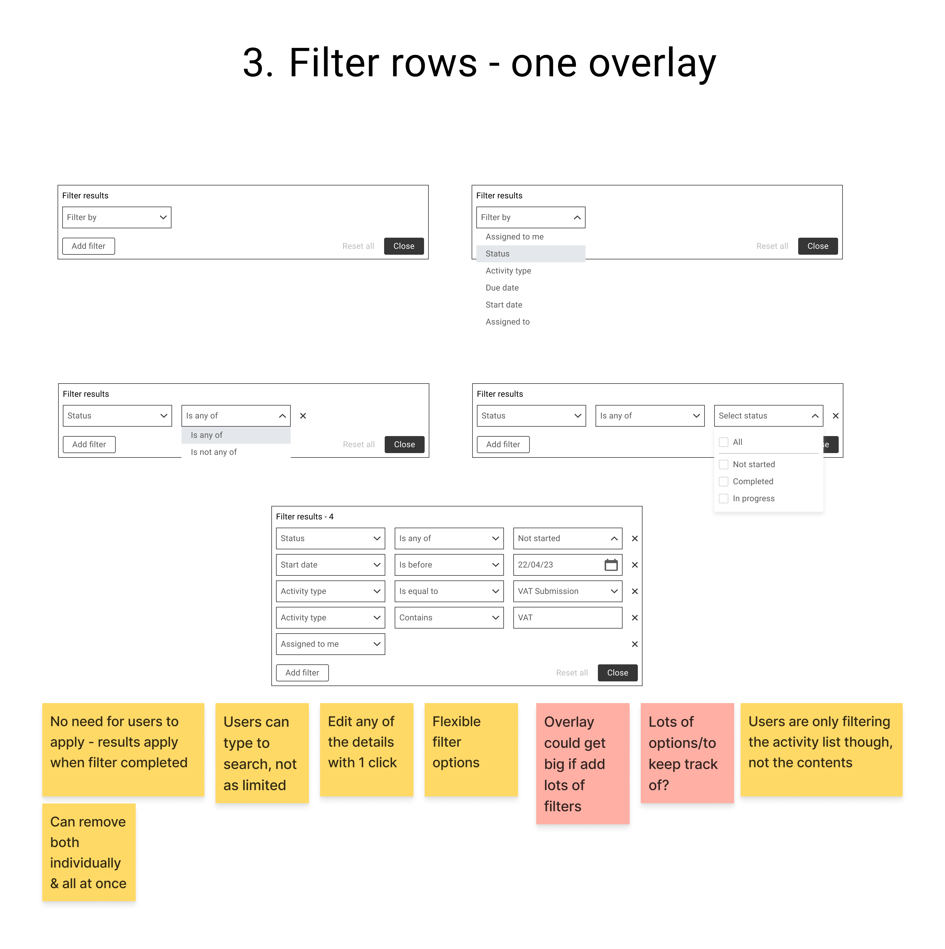
I experimented with a handful of different approaches to filtering driven by comments gathered at earlier research stages that it was difficult to know what filters had been applied with the current approach. Through testing we settled on the third option of an overlay menu, which allowed users to add detailed filters in rows. We concluded that we didn’t have enough space to line filter results up as chips, agreeing it was best to hide applied filters from the default view. The details of any applied filters were also accessible in one click, and could be edited or removed from there.
PAGE LAYOUT EXPLORATION
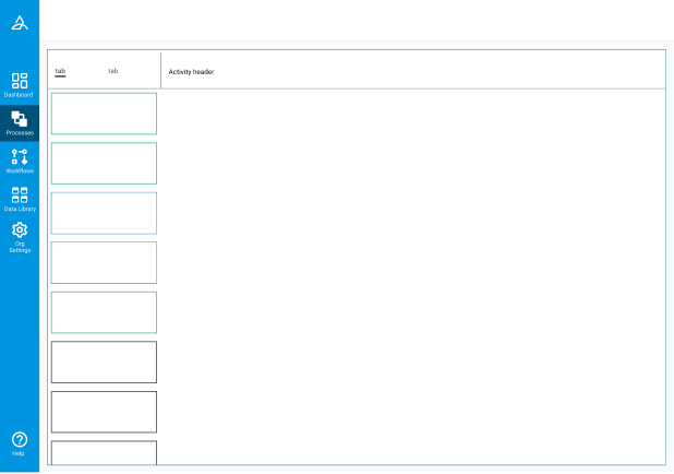

Alongside this filter work, I conducted my main task of reworking the visual design of the page. These are some layouts I experimented with based on some very early wireframes the designer leading this task shared with me. We made sure to work together throughout this process to uncover what our options were as early as possible and iterate throughout the process. One of the main features we were bringing to this page was navigation between activities, therefore a lot of our energy centred around making it clear what was selected, or not, at any given time.
FINAL DESIGNS
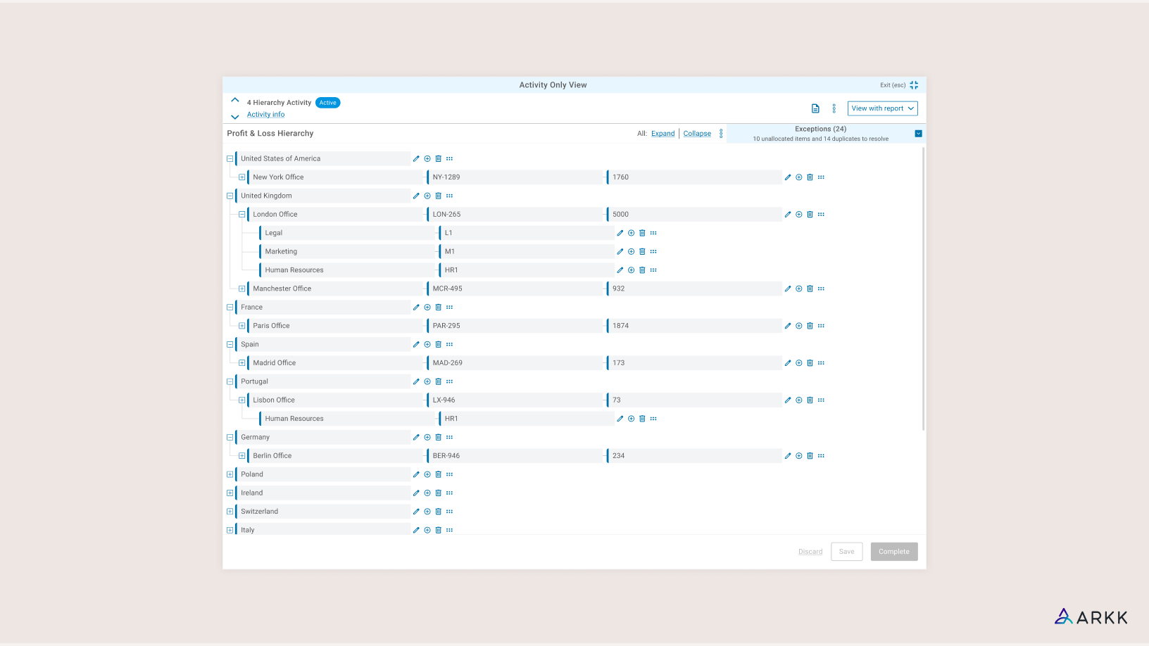
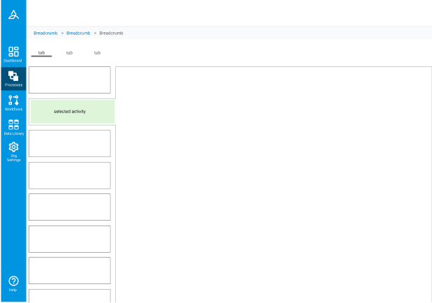
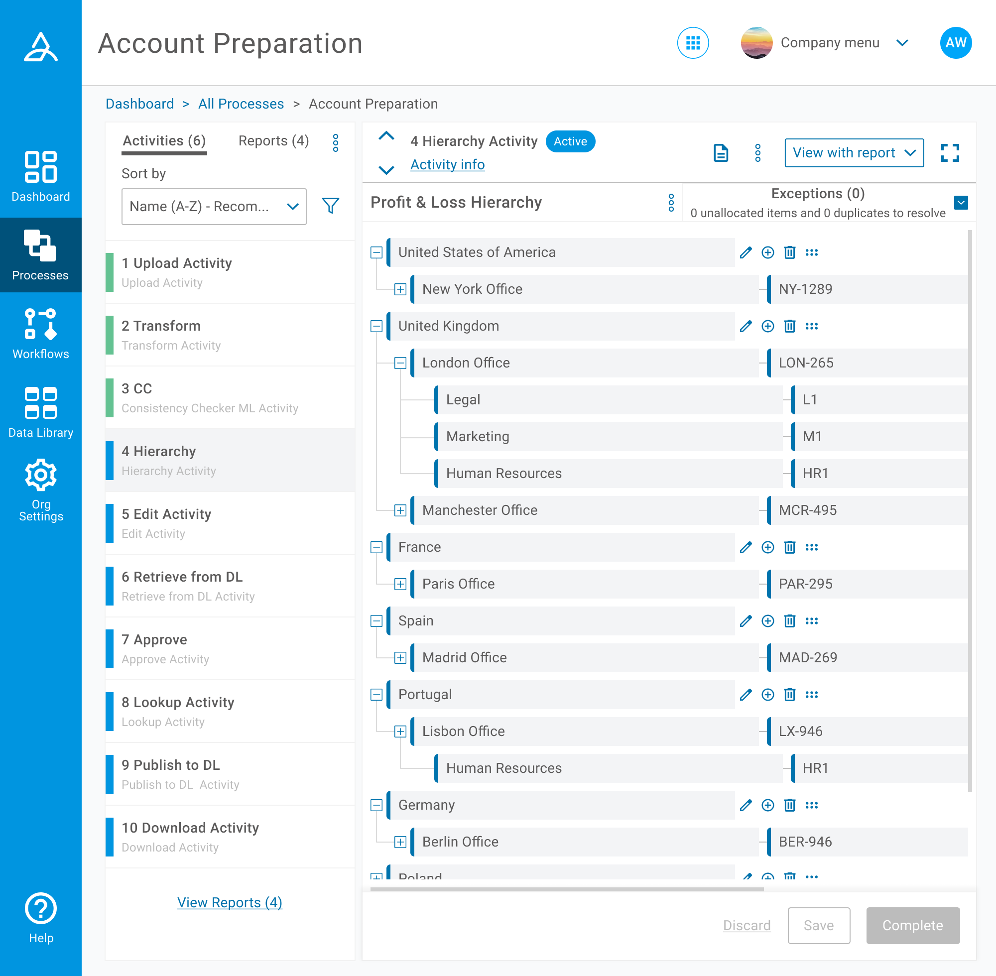
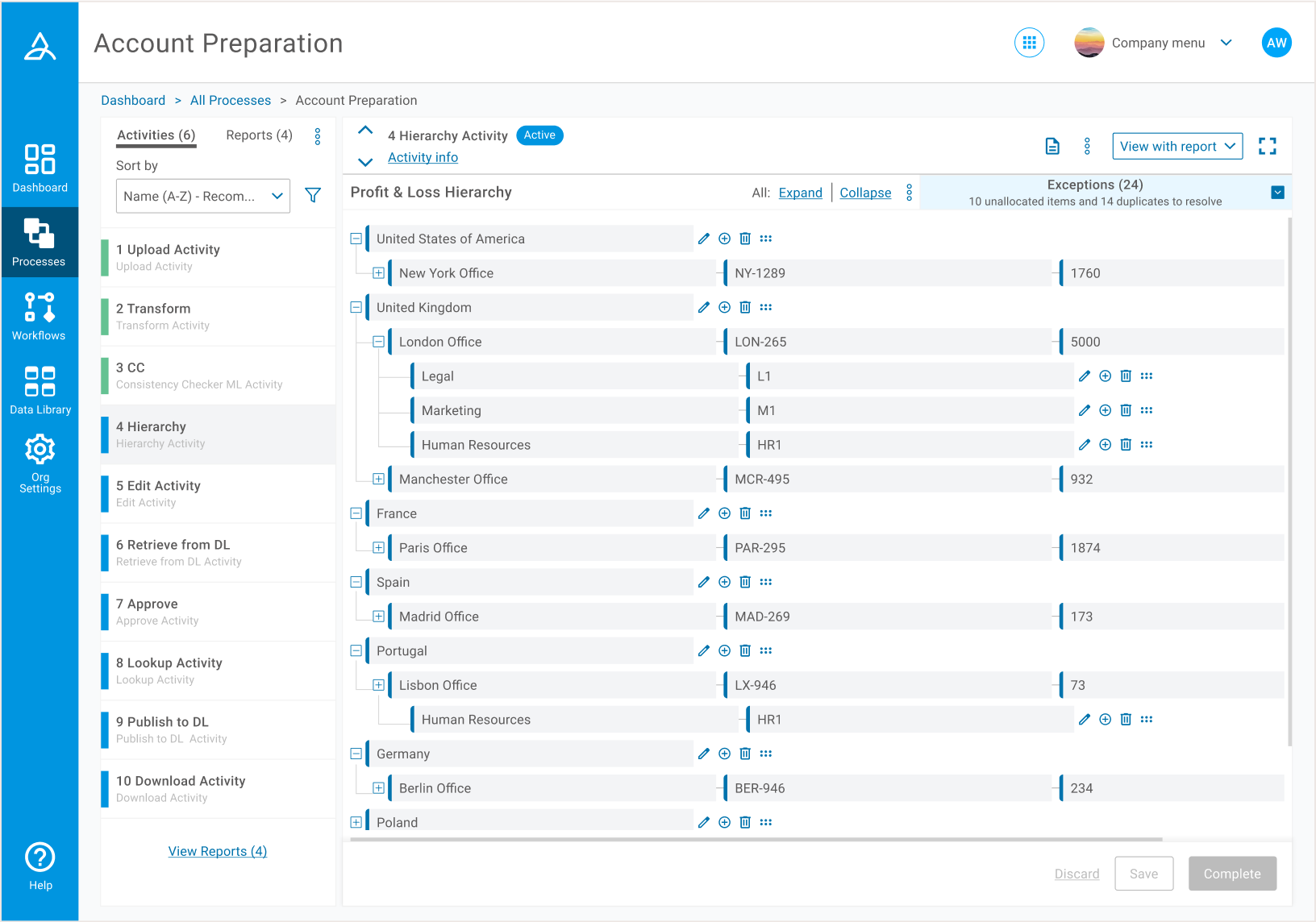 We brought in a navigation panel to give an overview of the activities users had, showing important high level information whilst not taking up the whole width of the page. This allowed users to view the contents of an activity, whilst simultaneously having eyes on all of their other activities. I explored many options for the selected state of activities in the panel, which were physically connected to the frame on the right, but we collectively settled on the subtle grey fill shown here.
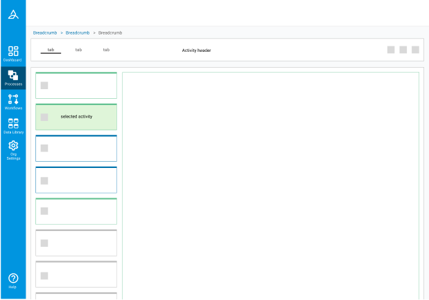
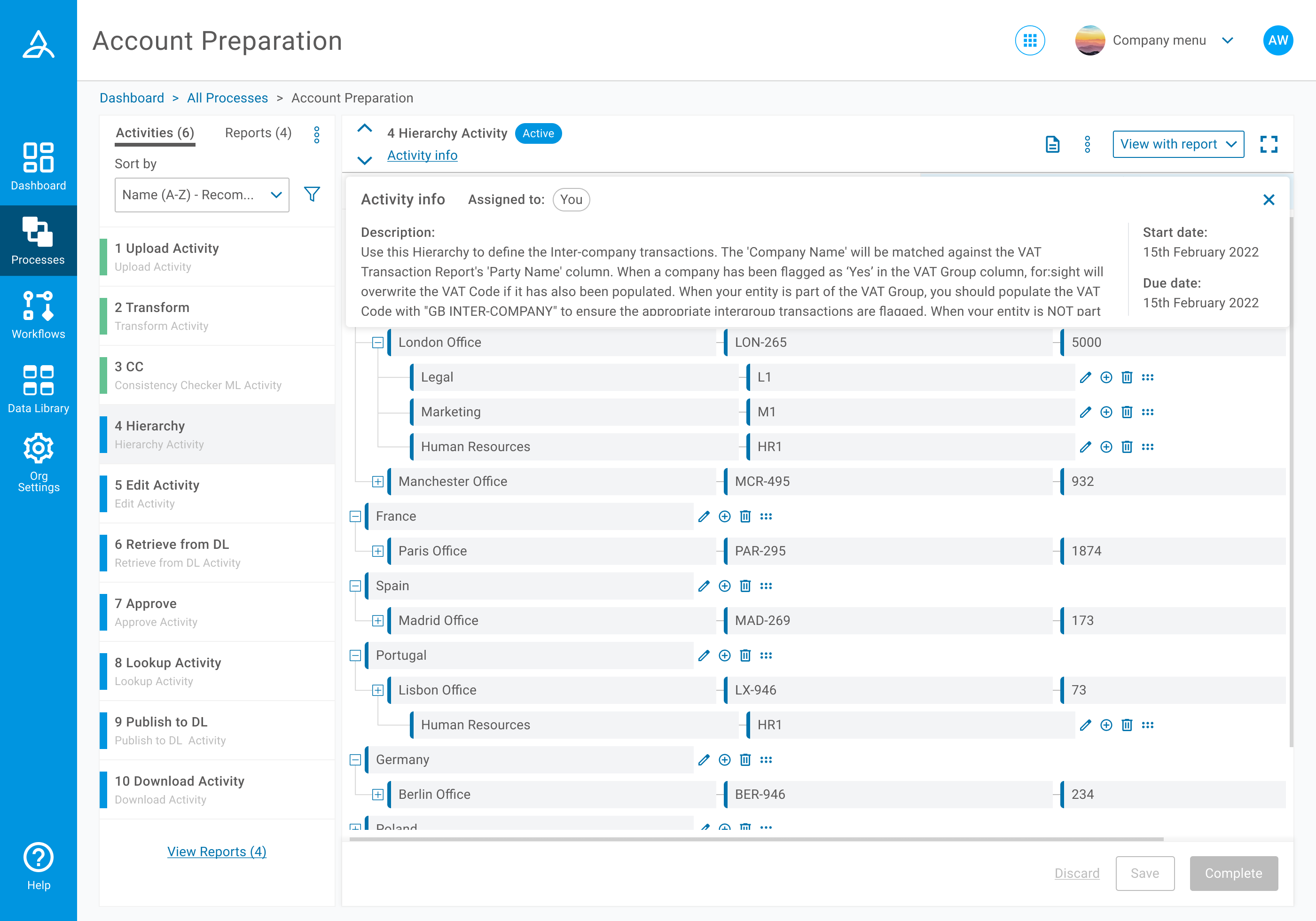 Information of lesser importance was hidden on an overlay. This activity info was found to be important, but more of a reference than something that needed to be on constant display.
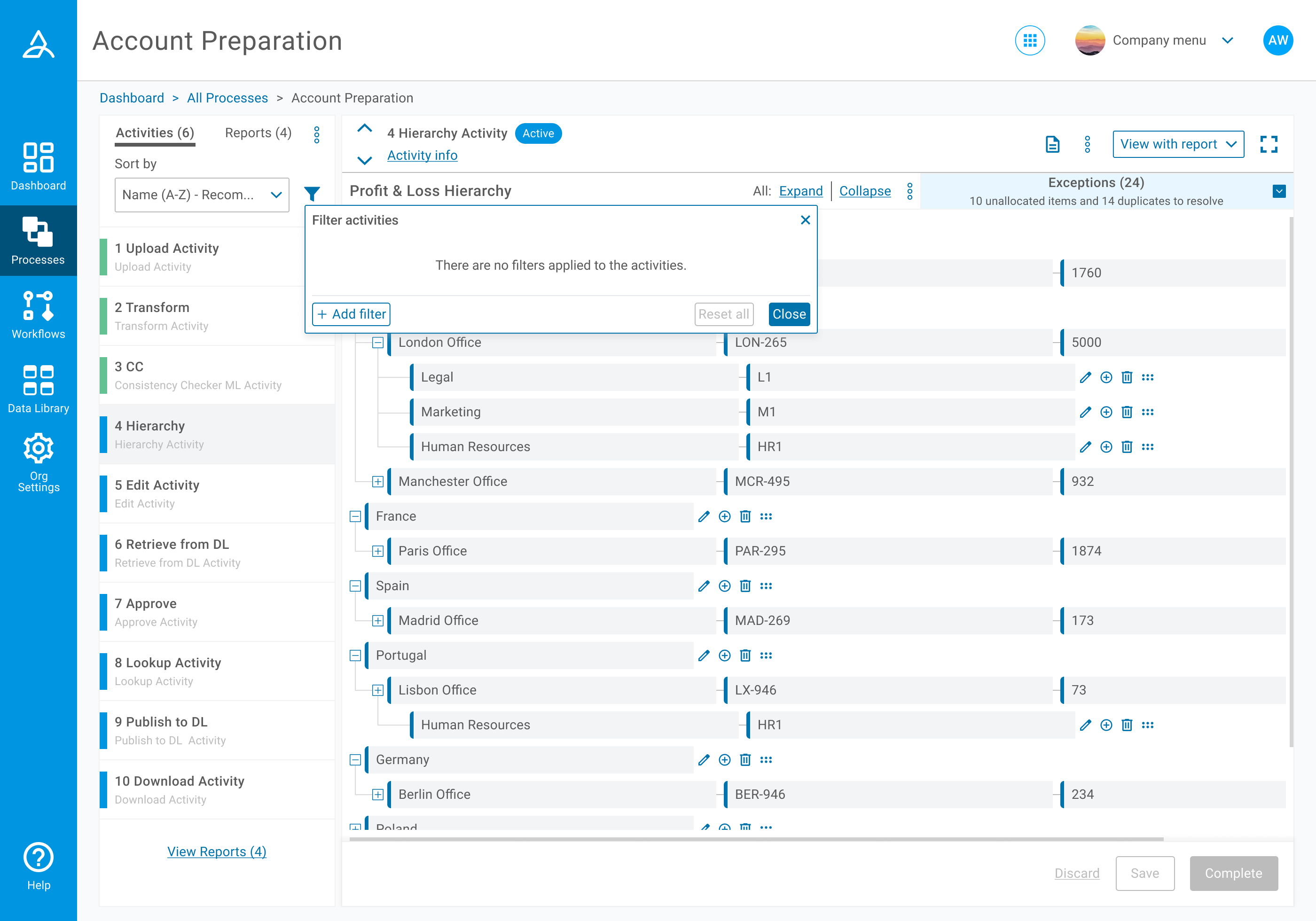
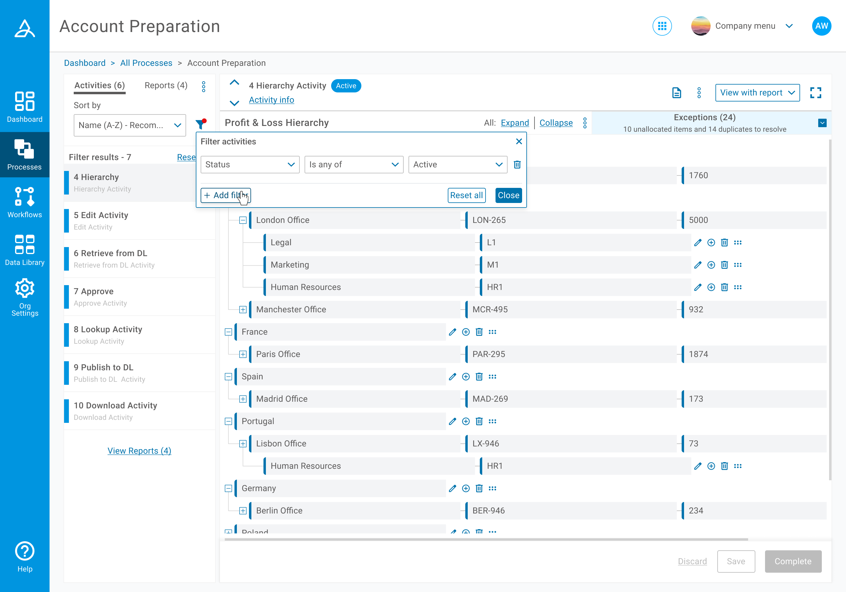
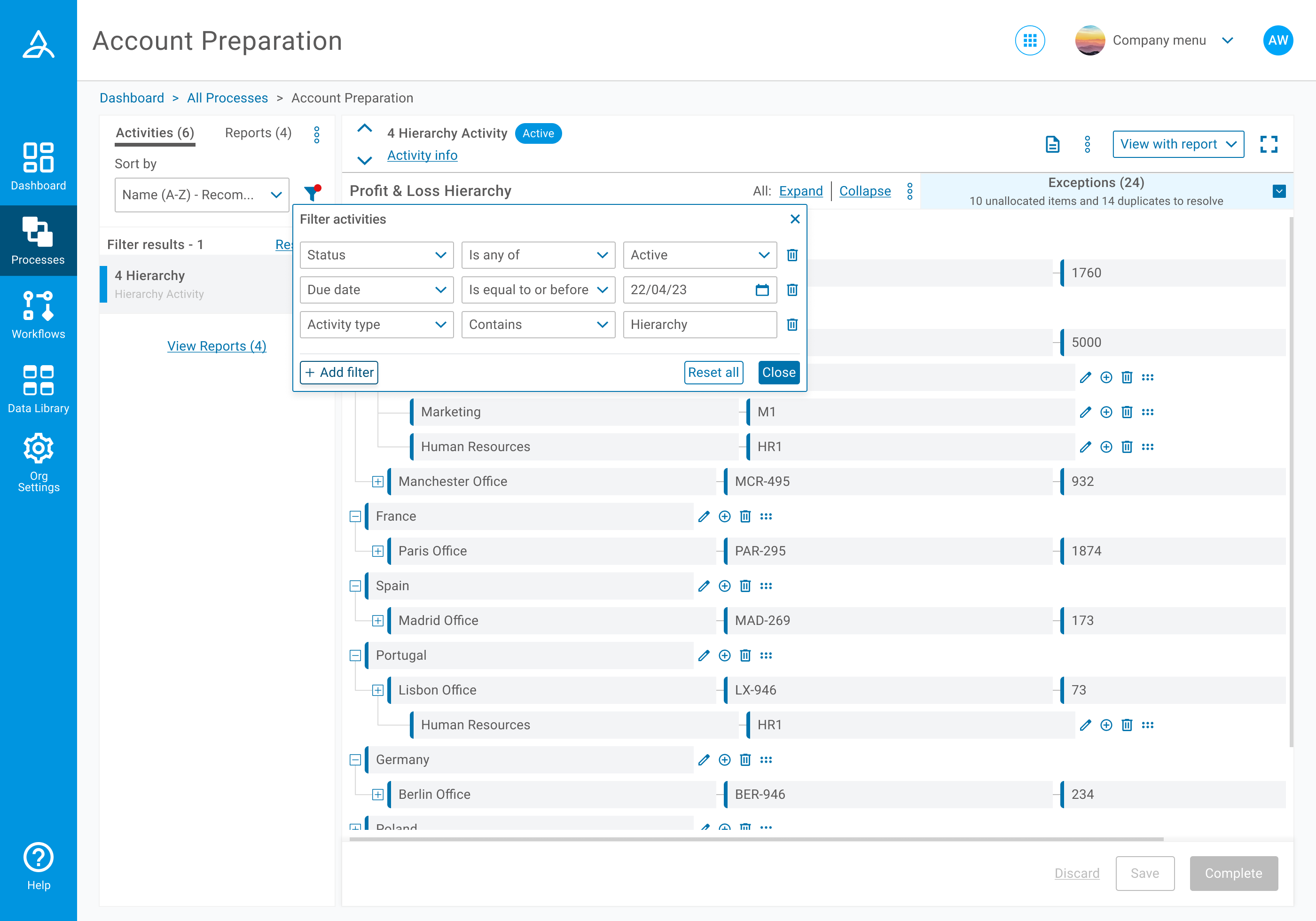 Users now had a clear indication of any filters that had been applied, and could then view the specific details of each filter easily.
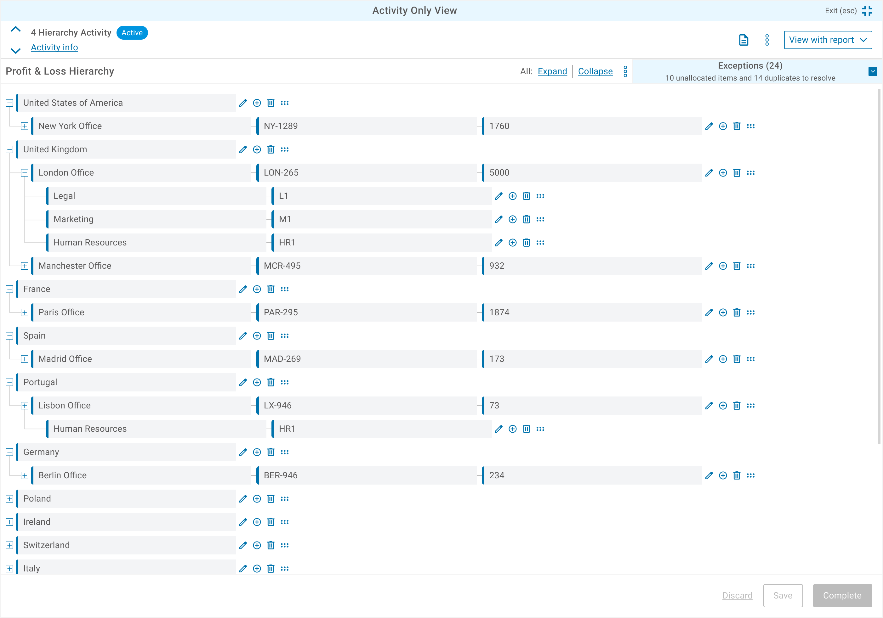 Full screen view.
 Minimum screen layout.
REFLECTION
This project took up more of our time than we had originally expected, but I personally enjoyed how that meant I was required to get involved in more of the UX research and planning to uncover the solutions we needed. The area that all of us wanted to develop further was giving users access to which activities fed into or out of others, which could be more than one and was not possible to see yet in this view. We did however massively improve the process page and all of us on the design team took a huge amount of satisfaction in hearing how customers were reviewing their processes more efficiently.