Product Portal
OVERVIEW
With several different products on offer, each of which had a separate sign in experience, ARKK wanted to align these to create a more unified product. Our secondary aim was to create a new area where users could learn about the other products on offer.
My role in this was predominantly as UI Designer, with responsibility shifting into UX following changes within the design team. Due to the forward facing nature of this project, multiple teams across the company were involved including Marketing, Development and senior management.
PROBLEM
- Separate sign in pages for 4 products.
- No easy way to switch between products.
- Old branding on sign in pages.
GOALS
- Create a shared sign-in with access to other products users may own.
- Make use of this new space to advertise all ARKK products.
- Allow customers to navigate between different products when signed into another.
- Update branding.
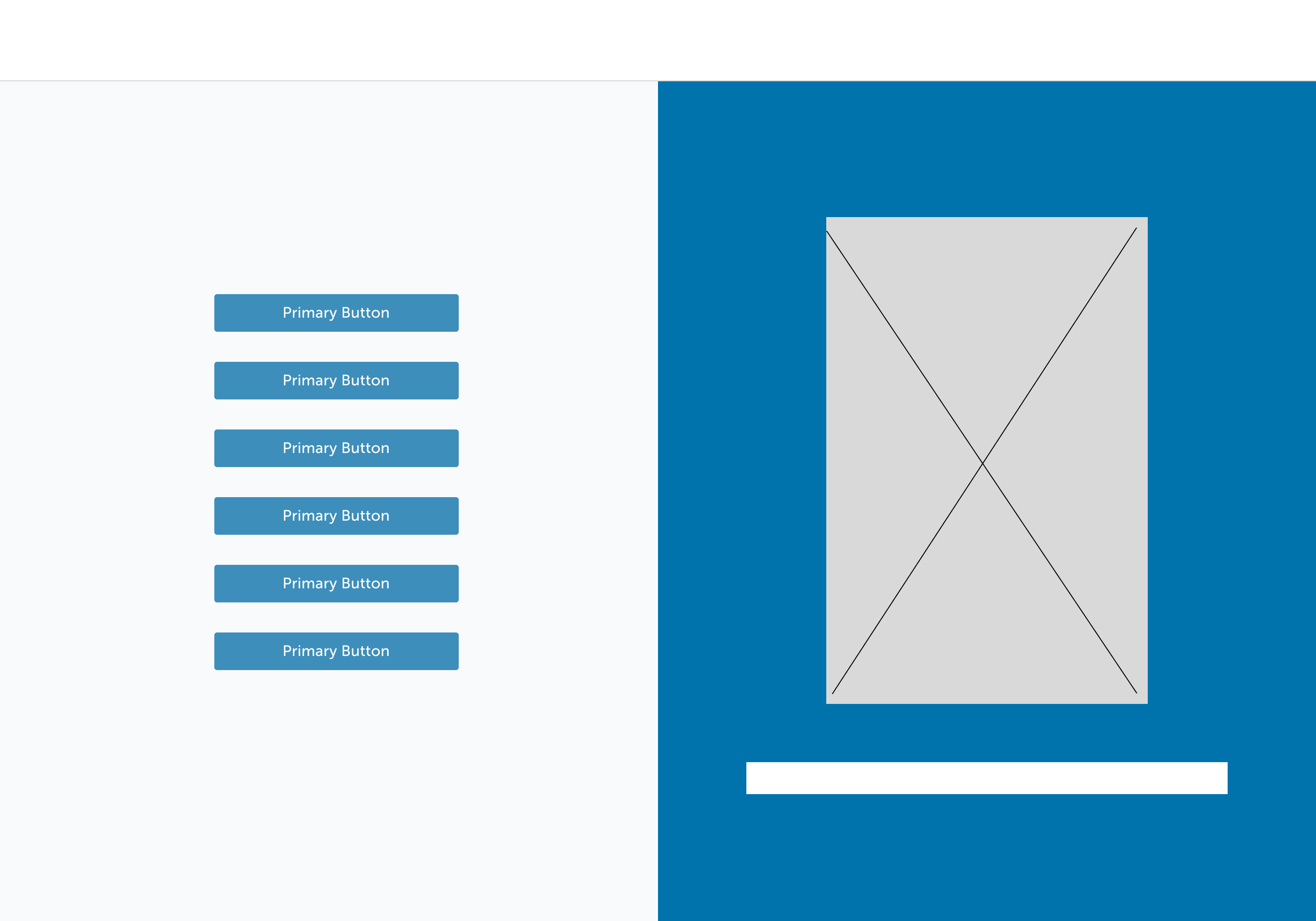
WIREFRAMES
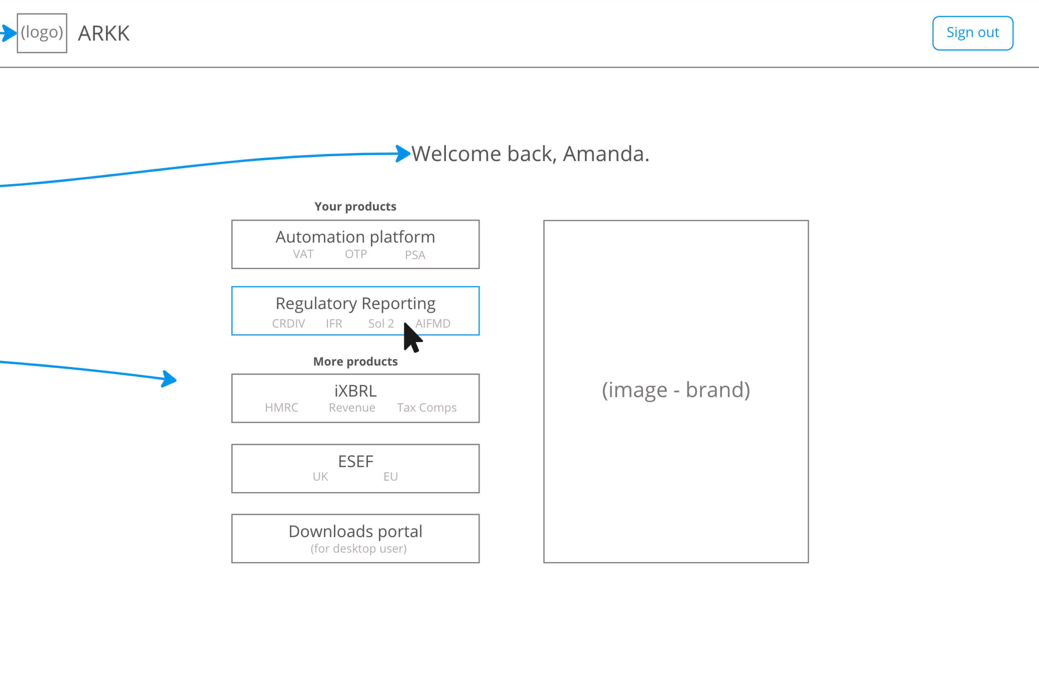
The Product Designer who was working on this project prior to my involvement developed some simple wireframes. These covered the new universal menu that would allow users to switch between their products, and the previous page where all ARKK products could get listed together, which was a new page we were introducing.
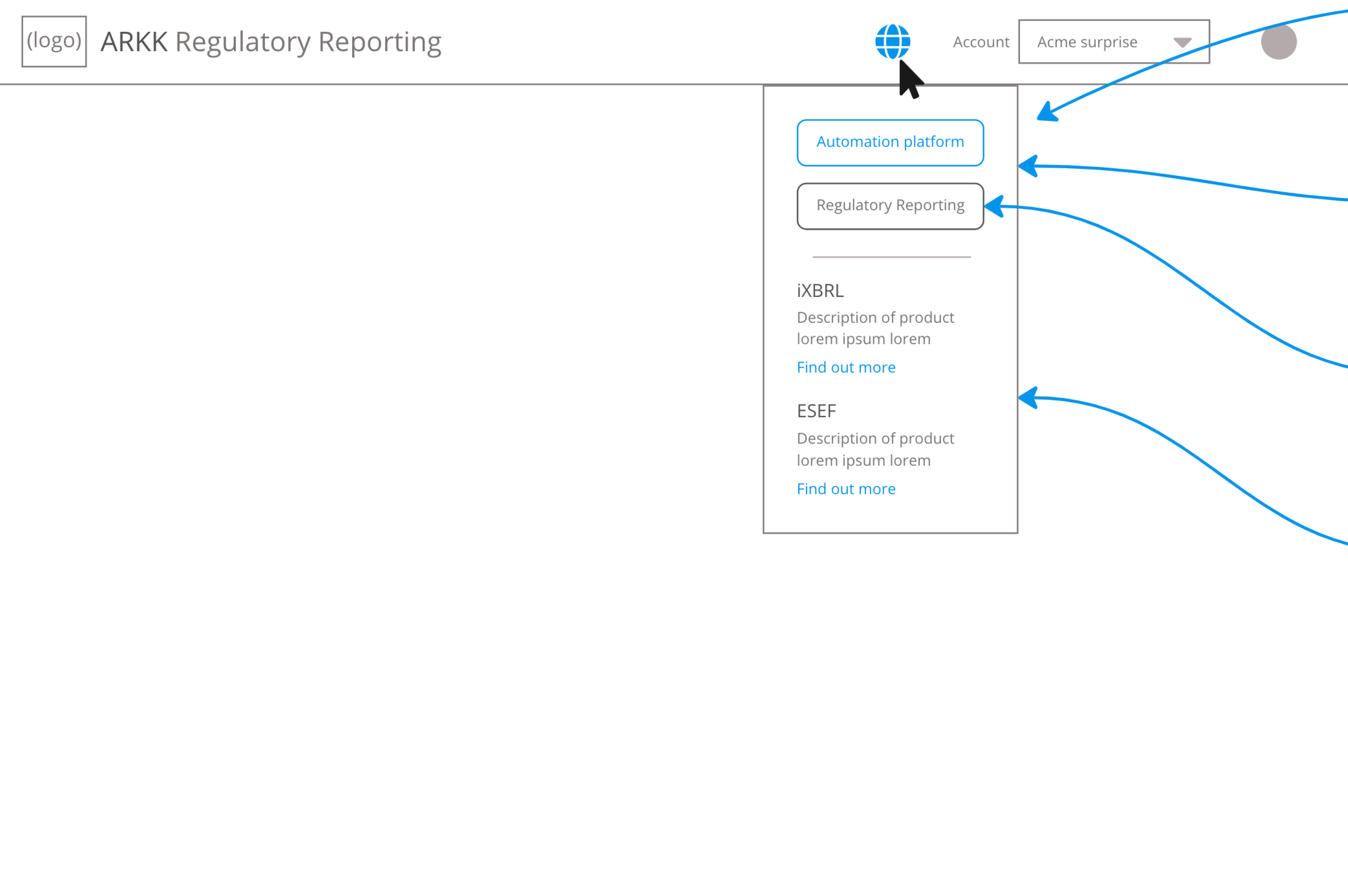
MENU & ICON EXPLORATION
I experimented with some ideas for the open universal menu and button in the page header, testing out different selected states and division of information.
FINAL MENU & ICON
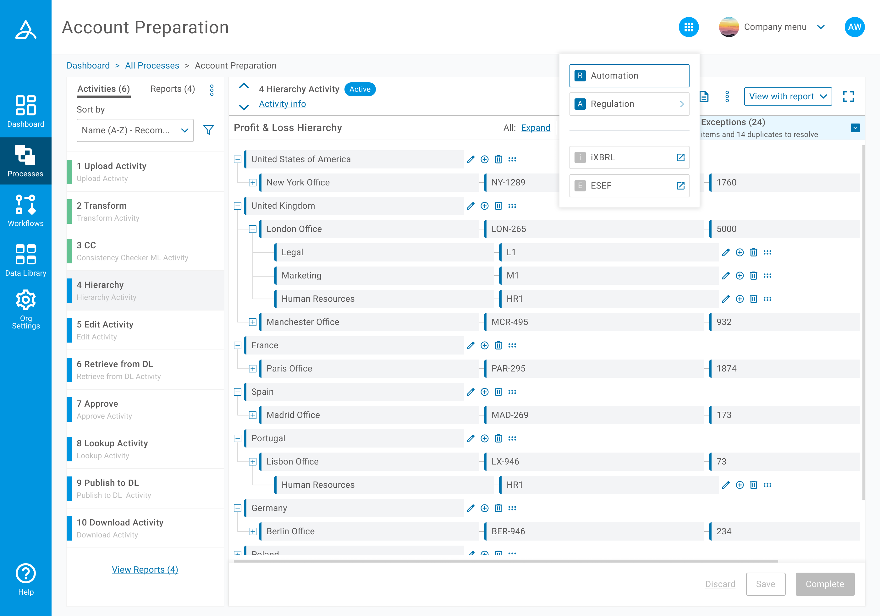
 For the button which opens the universal menu in the page header, we settled on an icon that resembled a grid of apps, with a border around it. From research I did of other well known products, this aligned with a common understanding of a multi product menu. The circle also fell in line with the rest of the page header including the organisation and user menus. We could then make use of a filled design for the open state. We did not feel the need to have this new icon as a filled circle in the default state as we knew most customers uploaded their own images for the other two menus.
 For the open state of the menu we wanted a very simple design, and one that mirrored the layout we chose for the portal page. Existing customer products got listed at the top, then others in the lower section, with an indication that if they clicked them information would open in a new tab to explain these products that they did not own.
LAYOUT EXPLORATION

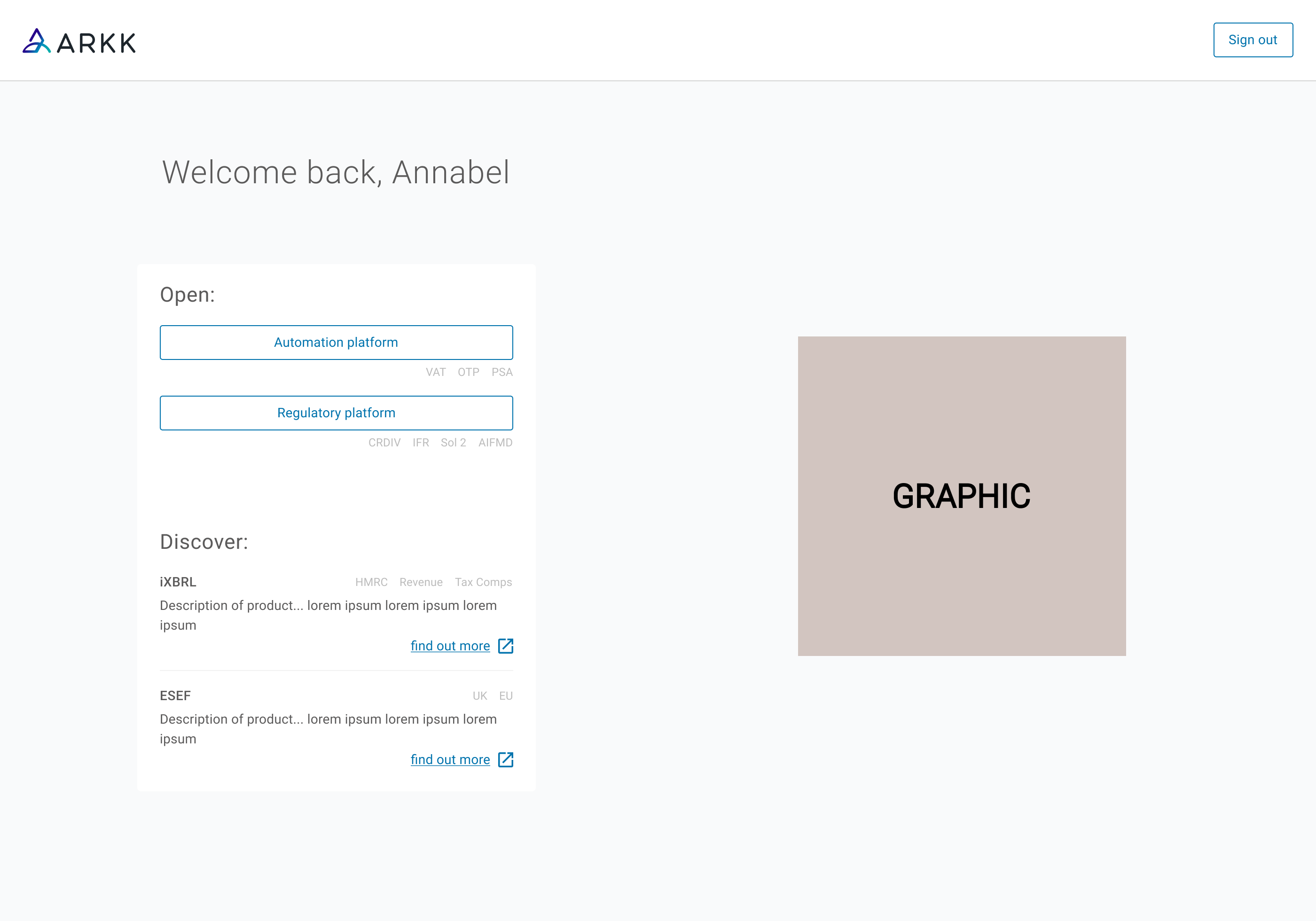
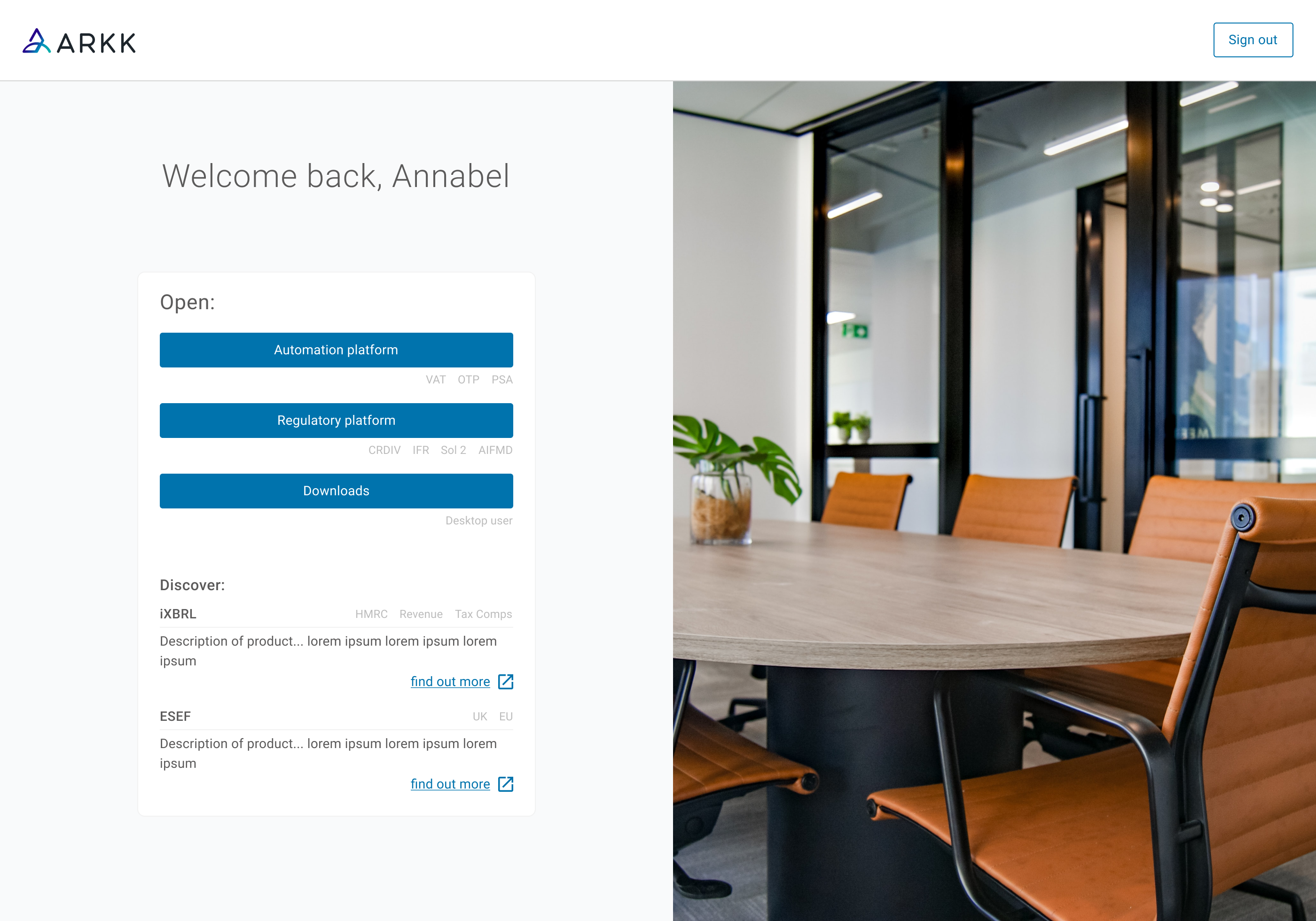
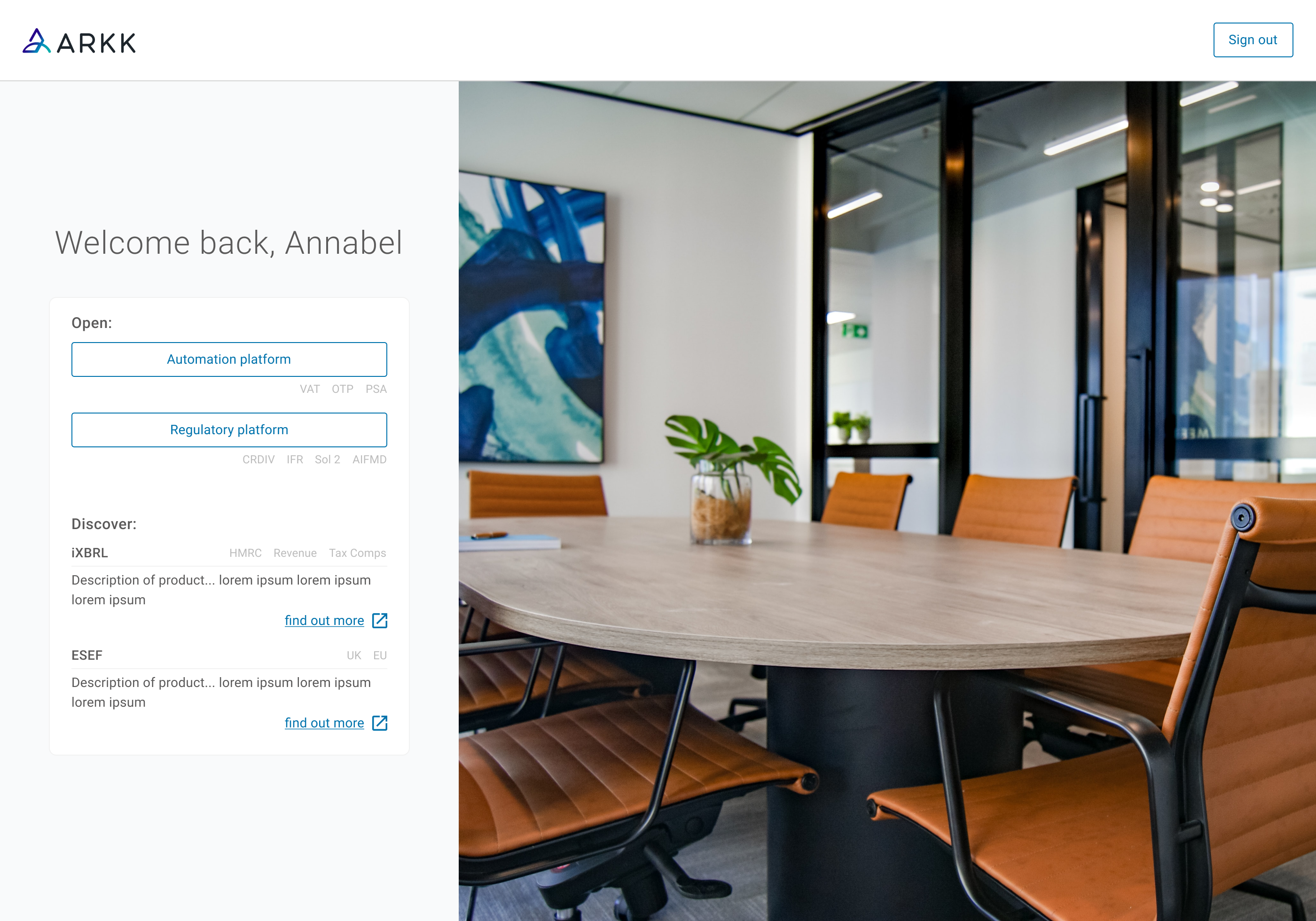
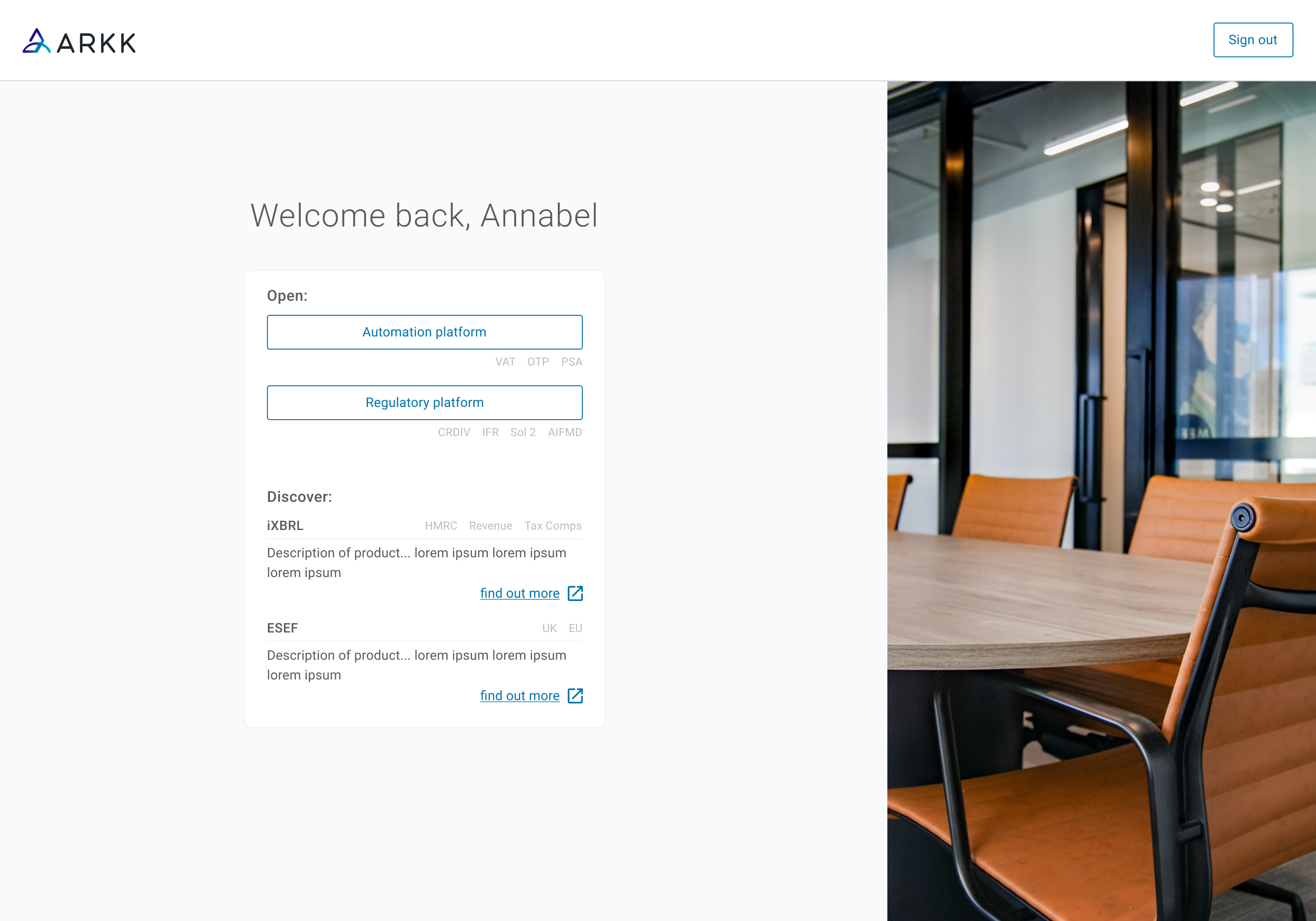
When exploring layouts for the new portal page, I was committed to considering the different options we had. I also wanted the final layout to be a group decision. We were initially drawn to using imagery, and applied photos taken around the office. When the designs went beyond the experimentation stage however, it was agreed that this created a corporate and far more clinical feel than we wanted. It was for this reason we made use of graphics instead.
Focusing on getting group buy-in for layout was one of the most valuable stages I carried out, as different people involved had different priorities and I was keen to get them all together to reach a collaborative decision. After one particularly successful meeting I had several messages thanking me for including them in this process, one which they do not normally see or participate in.
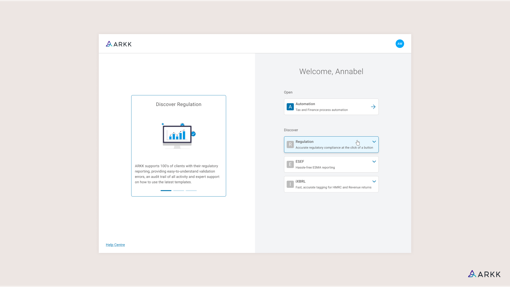
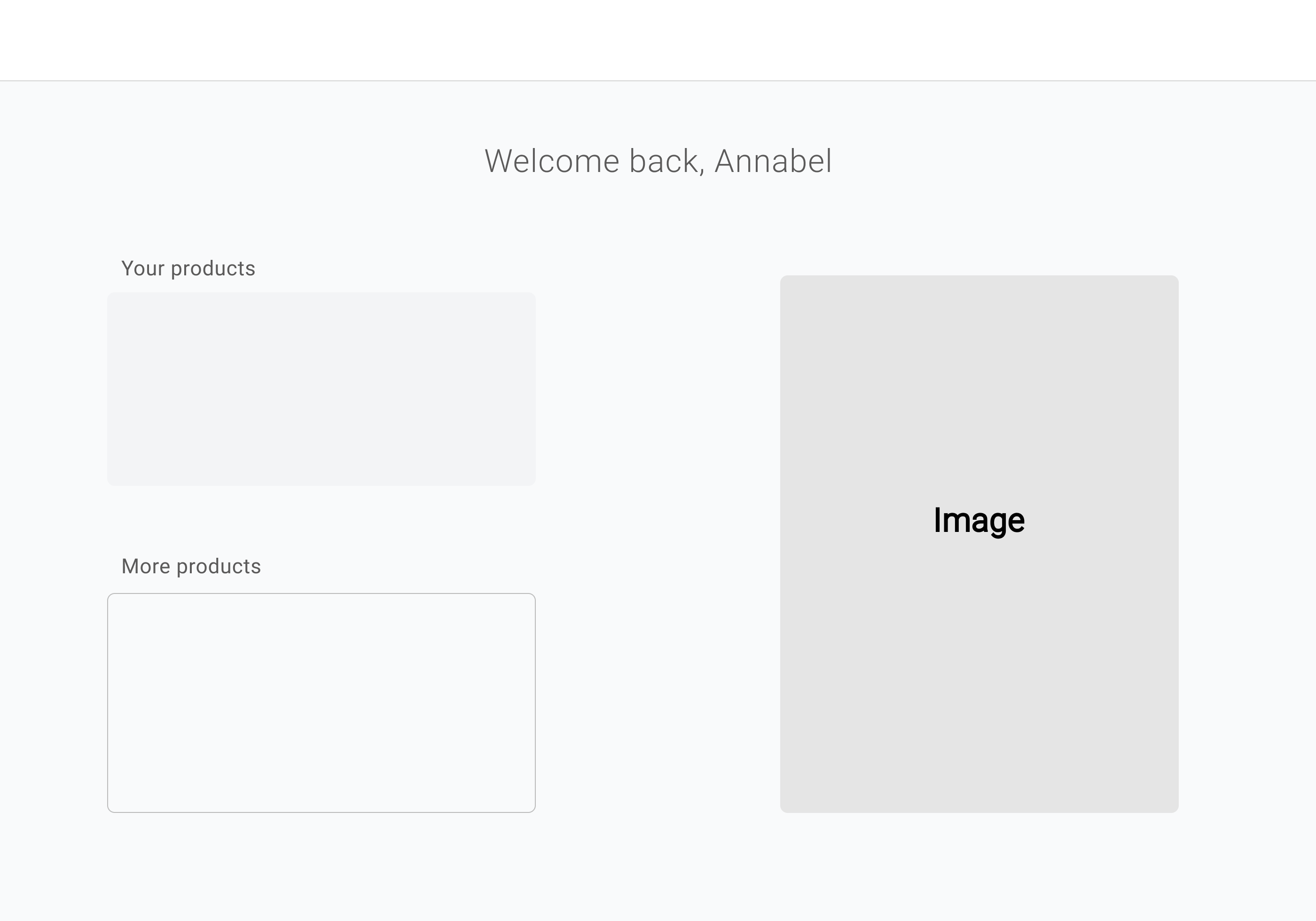
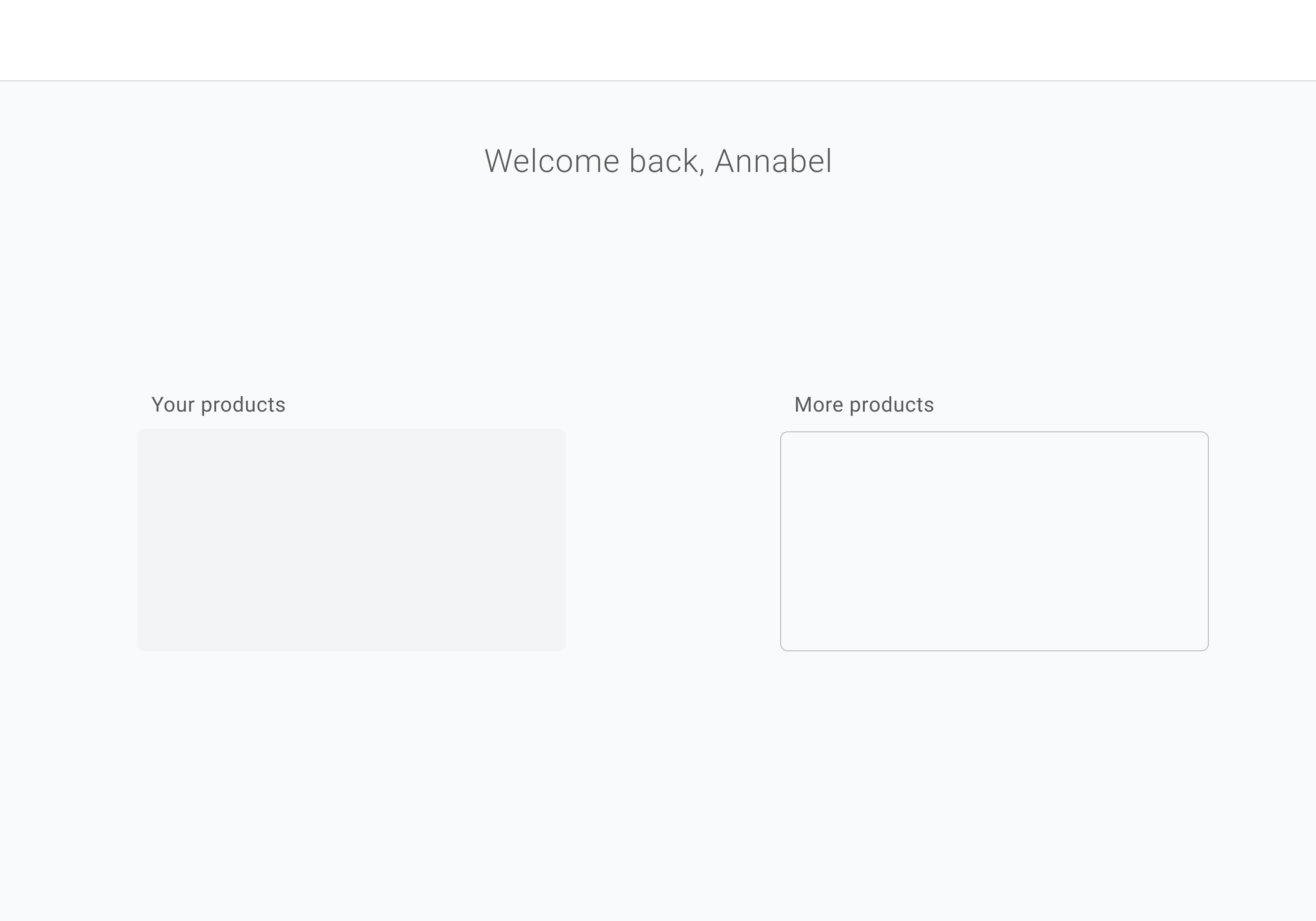
FINAL PRODUCT PAGES
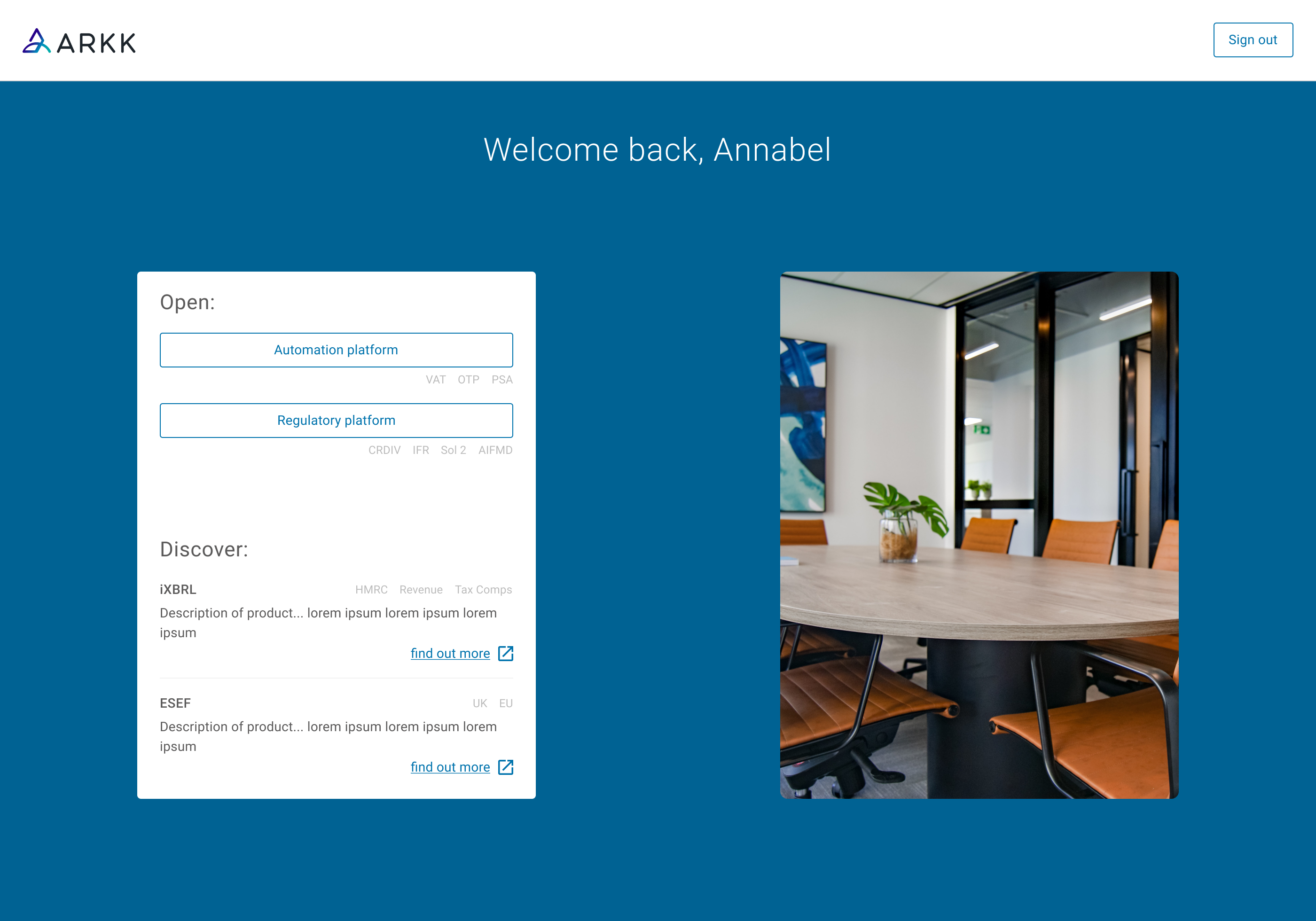
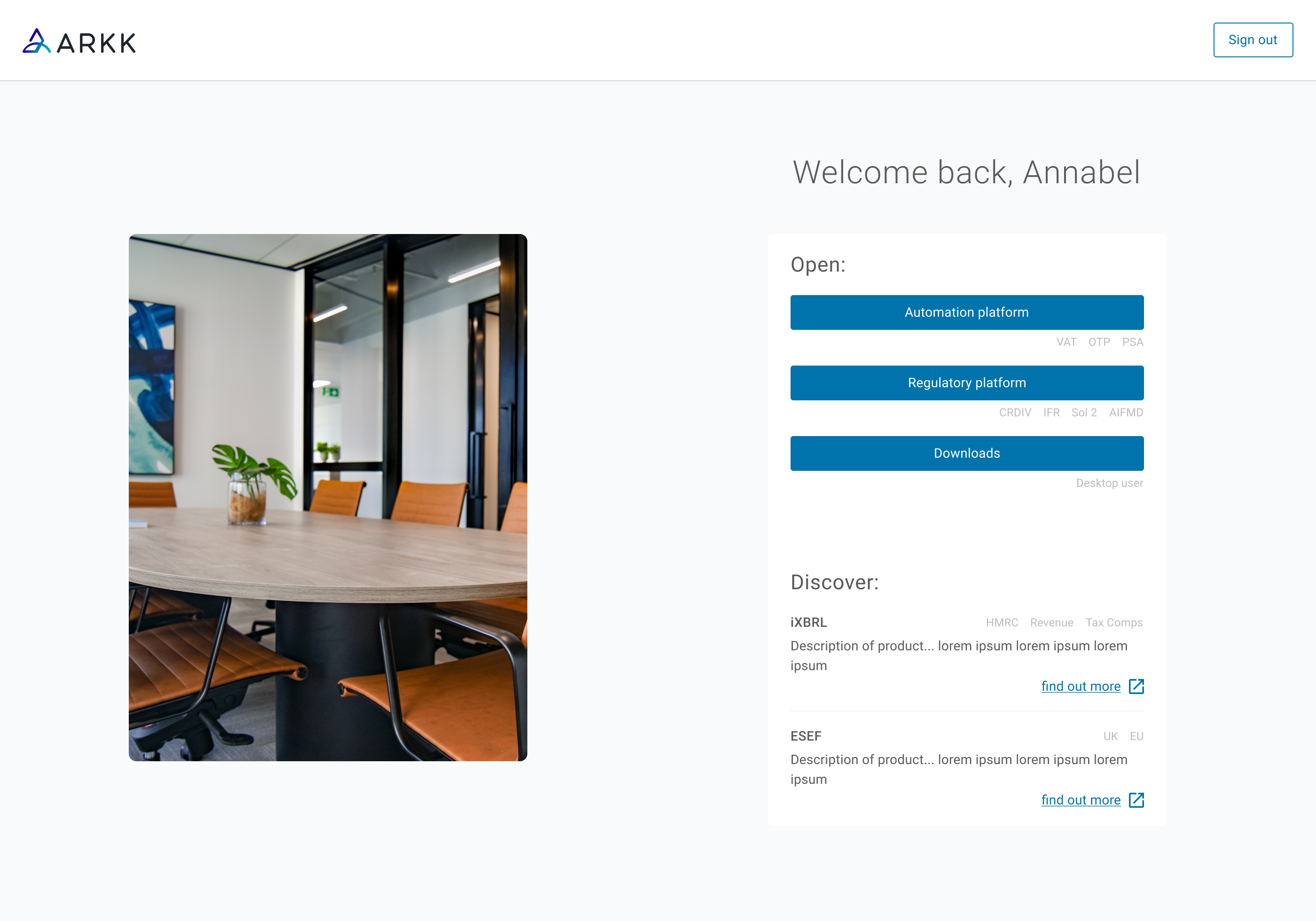
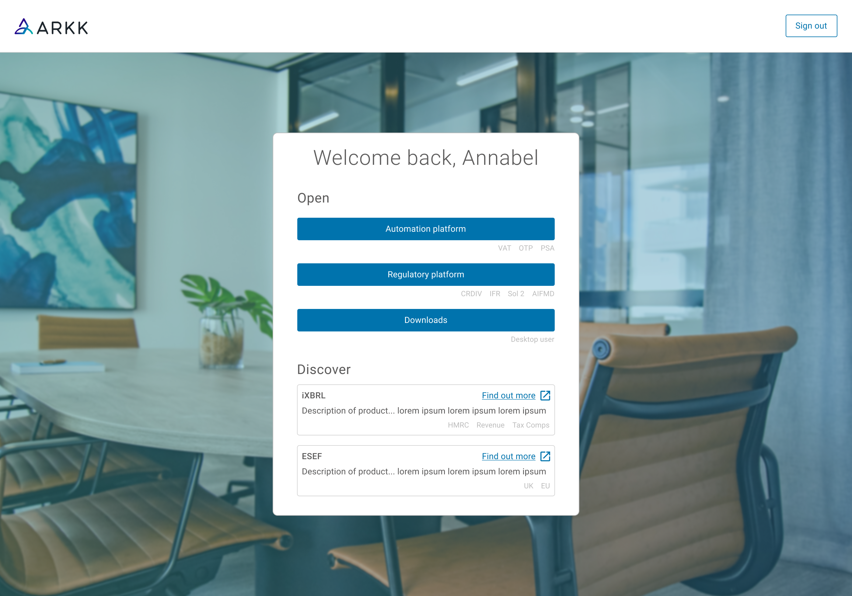
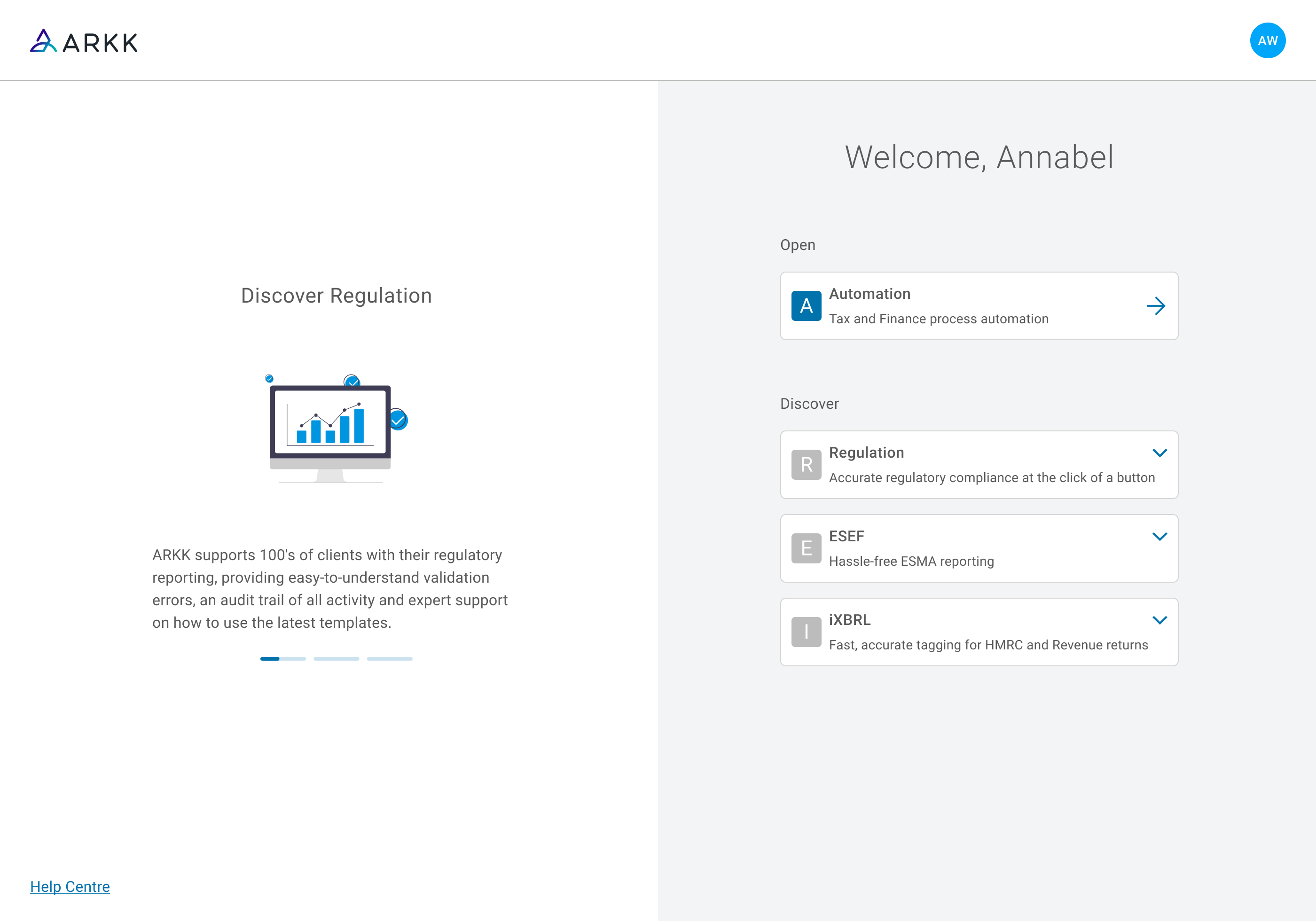 Products that customers owned appeared in the ‘open’ section, whilst those they didn’t sat in the ‘discover’ section. Information for the discover products rotated in a carousel on the left.
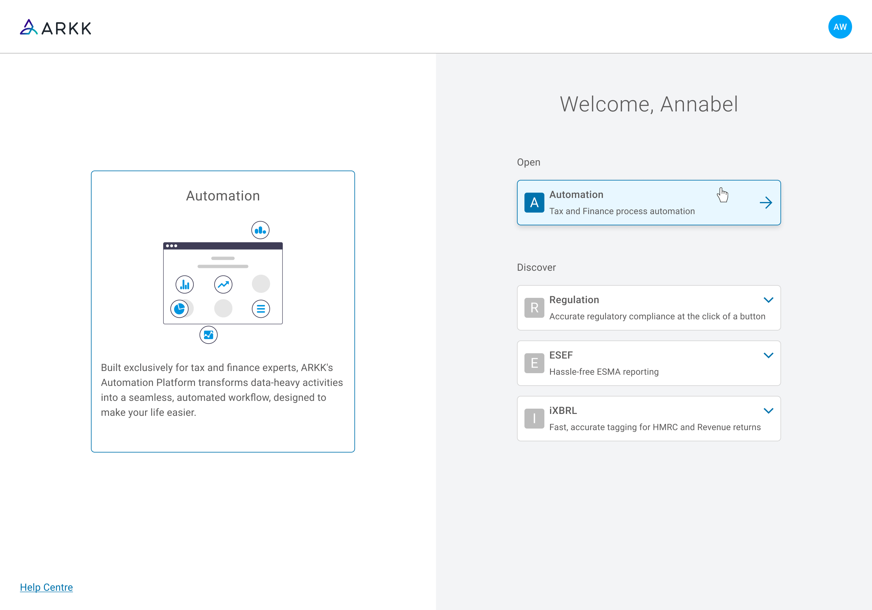 On hover of any product on the right, the image and description for that one in question would show on the left.
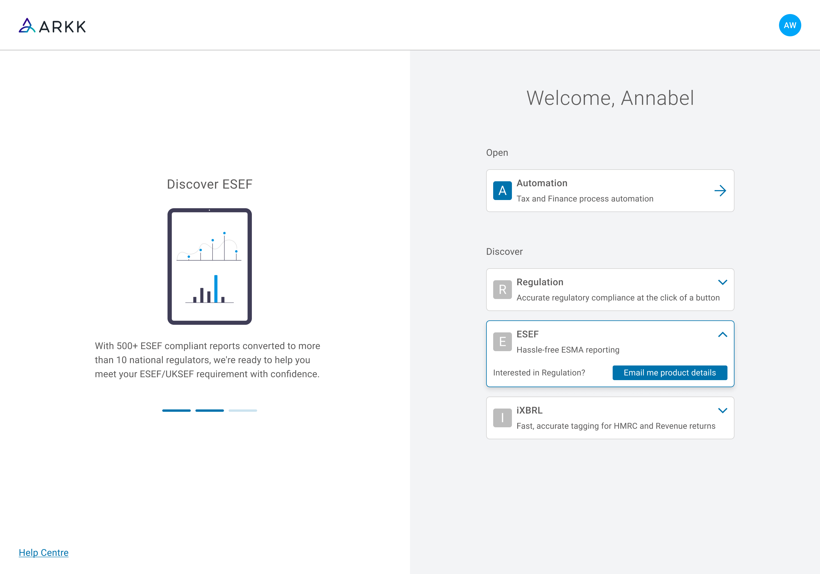 If a customer clicked on a product they didn’t own on the right, this would pause the carousel on that product and expose a button to receive more info.
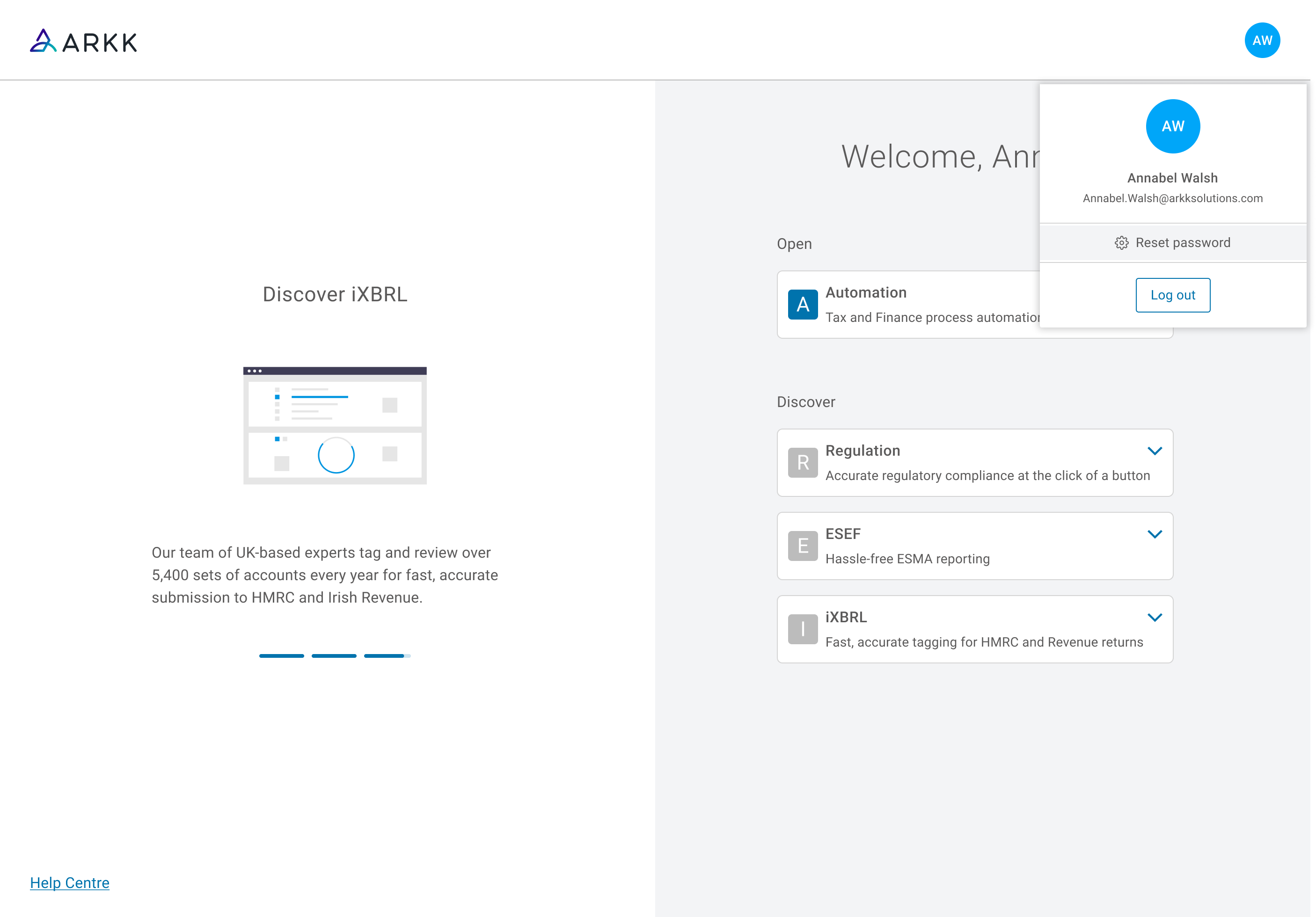 User menu.
RESPONSIVE BEHAVIOUR
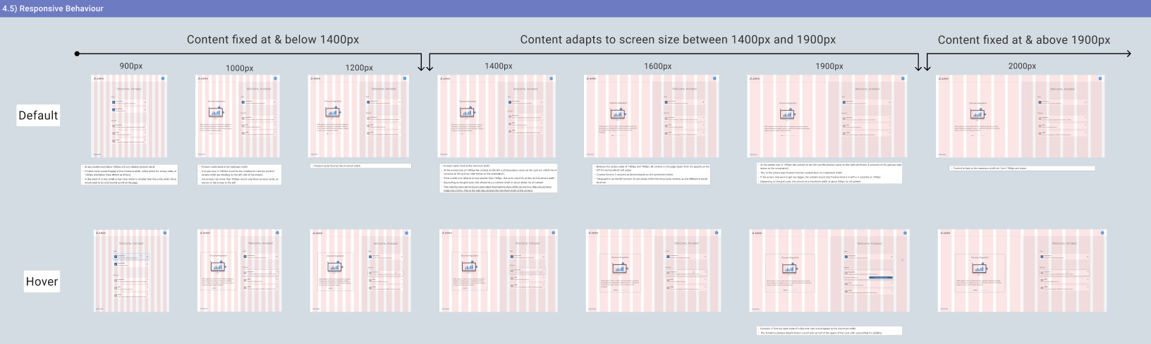 I made sure to lay the expected responsive behaviour for these screens out clearly for the development team. Stating when the contents of the page were to fix at minimum and maximum widths, whilst also changing the layout for screens below 1000px.
PROTOTYPE
REFLECTION
It was a challenge picking this project up from another Product Designer after a considerable amount of work had already been conducted without my participation. I did however feel a big sense of achievement in taking on these updates. I worked particularly hard to keep all the different teams involved in this project updated and part of our decision making. This also was not easy, but I got a huge sense of achievement from knowing I had maintained those connections, from the design to the final product.